Thinking cap on…
This does look interesting doesn’t it? Can’t decide, I sense some emotion is clouding my thinking. It’s hard to be mechanical huh…
Self explanatory chart of USDCHF:
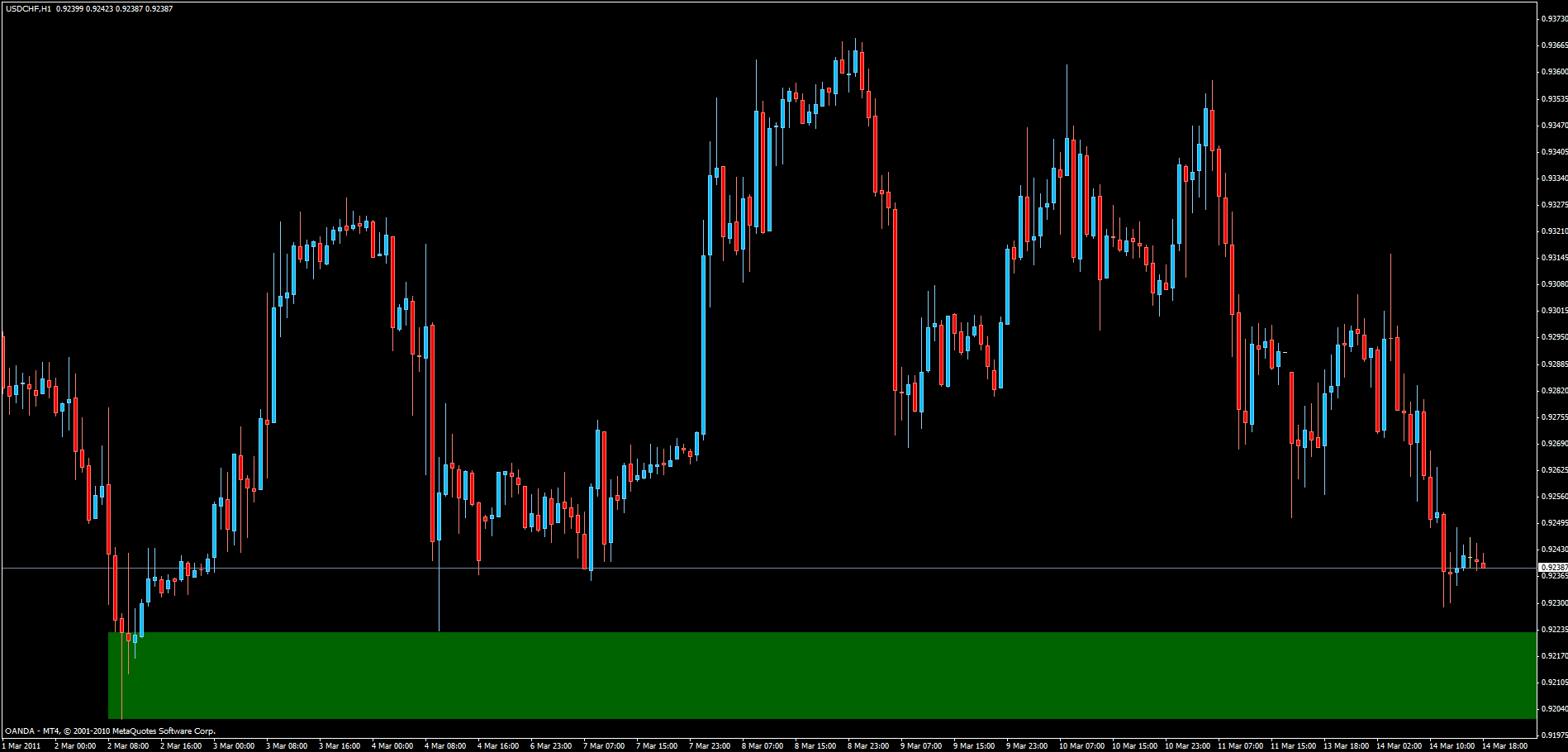
http://i923.photobucket.com/albums/ad76/o990l6mh/187ec724.gif
Thinking cap on…
This does look interesting doesn’t it? Can’t decide, I sense some emotion is clouding my thinking. It’s hard to be mechanical huh…
Self explanatory chart of USDCHF:
http://i923.photobucket.com/albums/ad76/o990l6mh/187ec724.gif
Well, I decided against the USDCHF trade I was contemplating. As we can see from today’s chart, that was the right decision.
It’s worth noting that there was a potential short entry as price retraced back to test the the zone from below, marked out by the cirkle. Didn’t catch that though.
Chart:
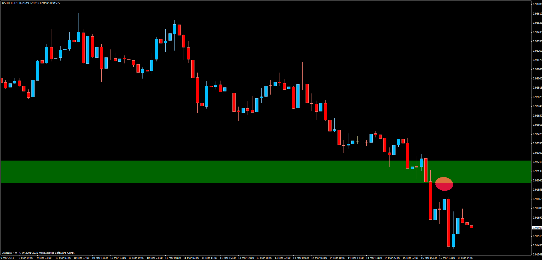
http://i923.photobucket.com/albums/ad76/o990l6mh/de9ad6d4.gif
On to the next trade setup… :50:
I’ve been marking-up my charts in a similar manner to you - Daily & 4H. I am now trying Daily & 1H, just because the 1H shows the detail a bit clearer. Looking at some past charts it looks OK. Most times it will mean slightly tighter stops - good & bad. Often when I looked at the lower TFs after a trade had turned at S/D & it had penetrated well into the zone, it had actually turned around the 1H candle body. Time will tell. If there is a large difference between 1 & 4H then I put a line at the 4H body & annotate for later.
Are you targeting 3:1 for your profit level or are you going to trade to supply or demand, or a combination? With the Gbp/Jpy 4H chart above - see the wick on the 18 Feb? Do you consider that a supply zone? It was re-tested 8 candles later (which is common) and then revisited on 4 March. In between it dropped more than 10:1 & since the March visit it has dropped > 20:1. I have it marked, but I’m not sure if I’m looking too closely again…
Bad luck with Usd/Jpy. Looked OK, but I’m avoiding Jpy probably to next week. Hey, what am I saying? Next week I’m going on holidays for a few days!! No charts! No internet! No computers! What am I going to do???
Hi Magnus, I thought I would upload these GU charts with some thoughts.
Firstly, an overview of the current demand zone, being re-tested as I write - 1 hour:

http://i777.photobucket.com/albums/yy54/madpipa/GU-110317main.png
Note the near-symmetrical shape defined by the thick red line. Pretty.
This is zoomed-in to the start of the same 1 hour chart:

http://i777.photobucket.com/albums/yy54/madpipa/GU-110317zoneend.png
8 candles at the start of the zone, 5 candles later a re-test, then price moved away 3:1 before another re-test that saw price move up 7:1 before returning. Then the major retrace that very quickly entered & left the zone for 13:1 R/R.
This is zoomed in to the end of the same 1 hour chart:

http://i777.photobucket.com/albums/yy54/madpipa/GU-110317zonestart.png
Price retraced into the zone twice - both quick moves with good returns. After each return the price left & 2 candles later had a ‘secondary’ retrace. The start of the chart didn’t have these. I wonder if there is any relationship between early & later retraces? I haven’t had the time to look into this but hope to in a couple of weeks. Either way, those ‘secondary’ retraces look to offer a good opportunity.
And as Sam said - as the wood gets chopped away successive retraces will move less & less from the zone until the zone is eventually broken. Looks like that may happen soon. It may be an opportunity like the Usd/Chf you posted - break through supply & re-test zone from below? Or maybe not…
Sorry for not answering sooner, been pretty busy lately.
I often fine tune the 4H zones using 1H charts. Like you say, it often gives a more precise view of what price was actually up to.
I target at the very least 3:1 and I will tend to take profit somewhat before that ratio is reached to reduce the risk that price just misses my TP by a little and turns again.
Ideal setups in my opinion offer 4:1 or better.
I’m having some trouble finding that wick you mention? Did you mean GBPJPY or GBPUSD?
I hope the holiday is/was great! Enjoy some time away from the charts! It’s nice to just turn off all the electronics once in a while and just… relax
I agree with your analysis. Obviously it’s hindsight now… but that wood chopping seems to have finally done it huh.
I’m sure there’s an order flow explanation for the breakout and retest a few candles later thing. Maybe big players probing to see how strong the s/d zone is after the breakout.
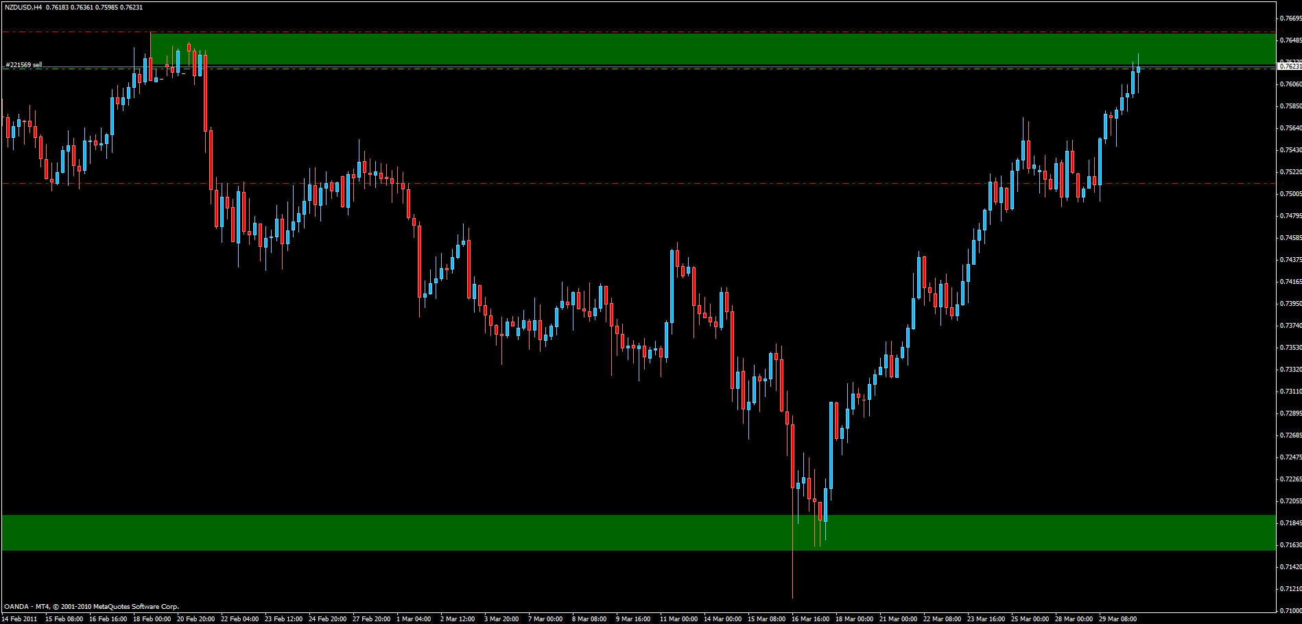
Since you shared your GBPUSD chart, here’s my GBPUSD chart. I haven’t edited it since March 13 and look how well it works. Worst thing is I didn’t catch the GBPUSD short…
http://i923.photobucket.com/albums/ad76/o990l6mh/da9f844e.gif
If it does have the good taste to drop a bit further and hit one of those zones I’ve marked below price, I’ll be interested in a long position.
I decided to reduce the number of pairs I watch. AUDJPY, CADJPY and CHFJPY were removed and voila, version 1.1:
Rules and Goals:
[ol]
[li] Trading commenced on March 7, 2011.[/li][li] Goals:[/li][LIST=1]
[li] The main goal is a net profitable result by the end of the year.[/li][li] The secondary goal is to achieve more than 10% account growth per calendar month.[/li][/ol]
[li] Trading will be performed using 1H/3H/4H charts.[/li][li] ForexFactory’s Trade Explorer will be used for tracking the performance of Phoenix Foundation[/li][ol]
[li] link: http://www.forexfactory.com/o990l6mh[/li][/ol]
[li] Account and charting[/li][ol]
[li] Oanda MetaTrader 4 will be used for charting.[/li][li] When MetaTrader 4 is not available:[/li][LIST=1]
[li] Oanda FXTrade charting will be used, or Netdania.com ChartStation demo will be used.[/li][/ol]
[li] Trading will be performed with an Oanda FXTrade live account.[/li][li] Trades will be placed using Oanda FXTrade or Oanda FXTrade for Android.[/li][/LIST]
[li] Charts will be analyzed for trade setups in the hours before GMT midnight.[/li][ol]
[li] An extensive analysis will be performed during the weekend.[/li][/ol]
[li] The risk per trade will be 2%.[/li][li] A stop loss is always used and it is placed a few pips beyond the high/low of the entry supply/demand zone.[/li][ol]
[li] The stop loss is moved to break even at around 2R as circumstances allow.[/li][/ol]
[li] Trades can be exited in three different ways:[/li][ol]
[li] By trailing the stop loss behind swing levels.[/li][li] By exiting at a predetermined level or R multiple.[/li][li] By stop loss being hit.[/li][/ol]
[li] Position size is calculated either by use of the custom made spreadsheet or by using Oanda FXTrade’s built in feature.[/li][li] Only setups that offer a potential for 3R or more are taken.[/li][li] Phoenix foundation trades setups where S/R lines coincide with Sam Seiden’s S/D zones.[/li][li] Only setups that pass the criteria from Seiden’s Odds Enhancers are taken:[/li][ol]
[li] Strength of original move[/li][li] Profit margin (3R or better?)[/li][li] Big picture (where are we in the higher TF S/D?)[/li][li] Retracement (first time back?)[/li][li] Time at original level (how big was the imbalance?)[/li][li] Price behavior during return to level (sharp rally up or slow gradual move? forming minor new S/D close to the level?)[/li][li] Levels on top of levels (each one that fails eats up some of the order flow behind the move)[/li][li] Higher TF trend[/li][li] Degree of level penetration (deeper penetration means a weaker level)[/li][/ol]
[li] Instruments traded:[/li][ol]
[li] AUDUSD, EURCHF, EURGBP, EURJPY, EURUSD, GBPJPY, GBPUSD, NZDUSD, USDCAD, USDCHF, USDJPY, XAGUSD, XAUUSD[/li][/ol]
[li] Additional funds may be added only after profitable calendar months.[/li][/LIST]
It’s strange how things change during life. I’ve been an evening person my whole life so far. Still am I guess. But I have noticed that I tend to wake up earlier on the weekends when I have no alarm set than I used to. I guess that’s aging… Not that I’m old though.
For some time I’ve started thinking about setting the alarm a little earlier in the morning and try to create a routine of looking through the charts then instead of in the evening like I do now. An added bonus would be that I may even find enough time in the morning to start having breakfast before going to work. Could be good for both health and trading… win win. This is an experiment I’m strongly considering, might be worth trying at least. Not sure my body will go along with it when the alarm really does go off 20-30min earlier, but there’s just one way to find out.
Means I’ll have to get to bed earlier in the eve as well… that might be a hard habit to change :33:
The pros are clear anyway:
[I]Same routine every morning unlike now when it depends on how much energy I have left after work/training etc.
Start having breakfast again after a 6-7 year hiatus
Looking over the charts just before European markets open[/I]
Hmm, maybe I’ll try it next week 
Thanks! Will certainly try to.
Took this trade a little while ago. Self explanatory chart I think:
I usually have poor results with trades that I post, so we’ll see.
As should be obvious by now, I’ve removed/scrapped everything but supply/demand from my way of analyzing how price moves.
I’ve also settled for longer time frames, such as the 1H and 4H. They’re my best fit so to speak.
I have however not been able to completely let go of the idea that there must be a way to capitalize on the very short time frames as well, if I should find time available. I know there are many ways to do this, such as by using a top down approach, finding a setup/bias on the higher TF and then stalking a good entry on the short TF. That’s certainly a good way of doing things.
What I’m after is something a little different though. I’d like to find a way of just opening a, for instance, 1min chart and be able to tell what the s/d equation suggests is most likely to happen next. In the past I’ve tried placing lines in different ways etc but to no avail.
Tonight I’d like to share something that just hit me. Mind that I have nothing but a few minutes of chart flicking to back it, in other words this is more idea than substance. Mind also that the idea I’m going to post is most probably already well known and circulating on various threads under various names. I don’t claim to be the discoverer by any means.
Here’s my observation:
Open up a min chart of a liquid pair, eurusd for instance.
Put a vertical line on your chart to mark out London open - we want to do this when the market is at it’s most active.
Now we wait for a big candle, ie a candle that moves a substantially bigger distance than the candles to the left have been doing on average.
Enter on the close of the big candle in its direction
SL and TP are things I have not worked out yet.
What I’ve noticed, or think I’ve noticed anyway, is that the big candle is evidence of s/d imbalance. The last seller or buyer is gone and price moves away violently. The interesting thing is that this is almost never a one candle story. Usually price moves further in the same direction by the same distance as the imbalance candle or more.
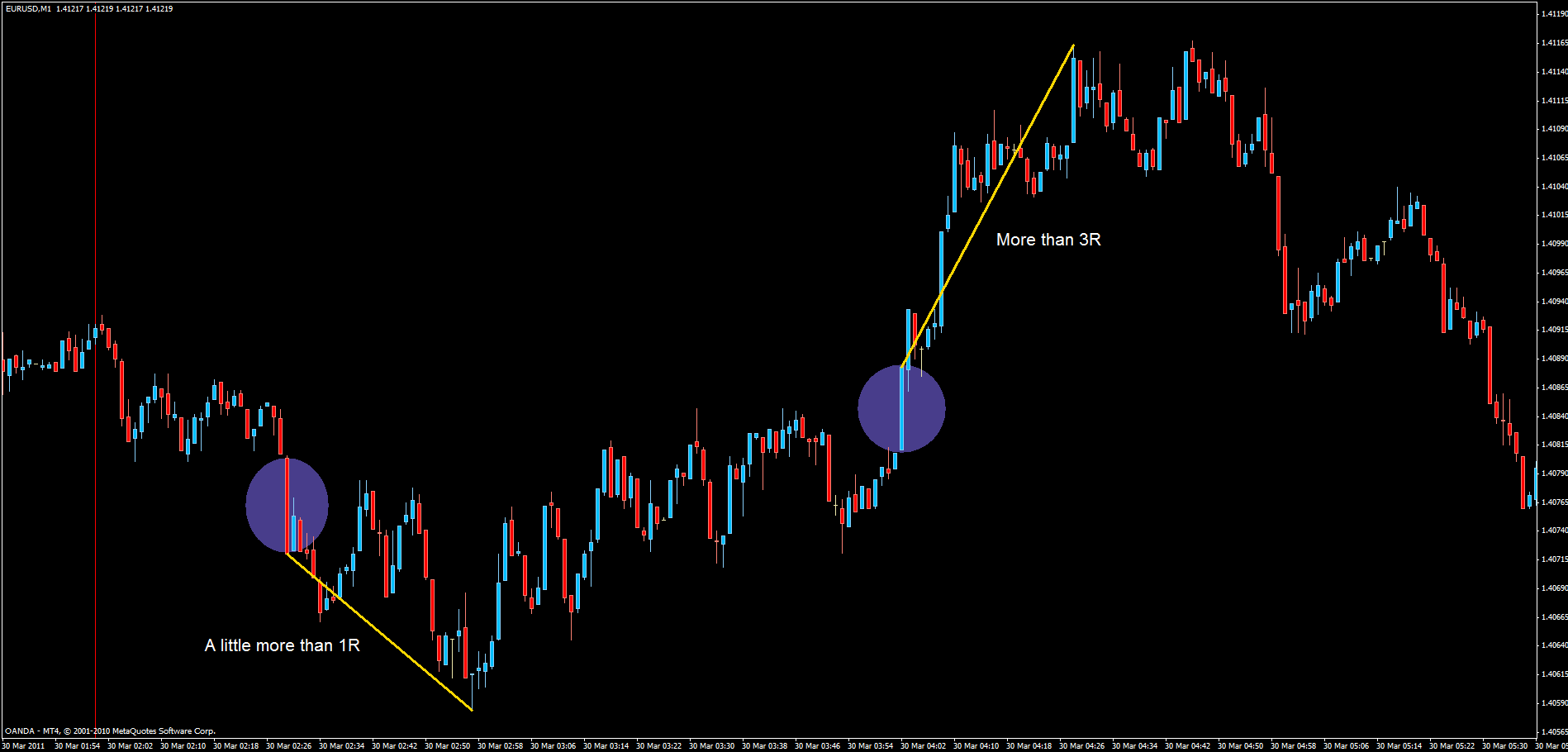
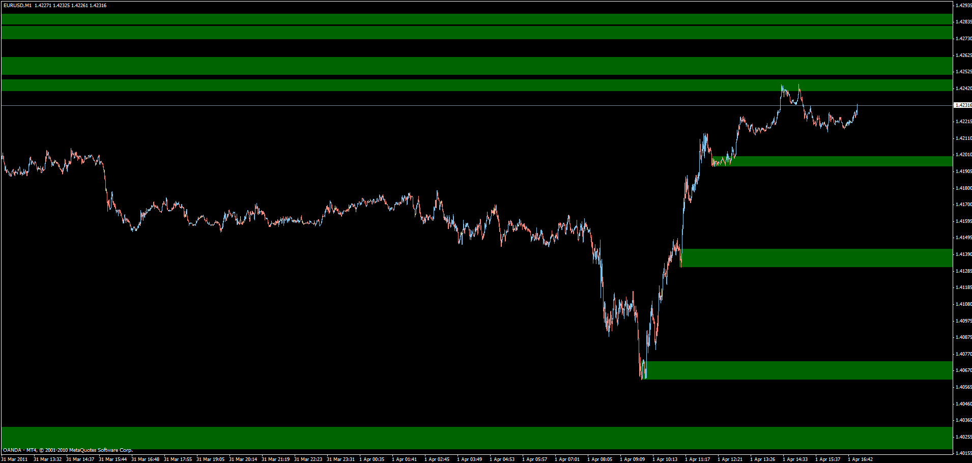
This chart I just picked as it was the first one I looked at, no cherry picking at all (I’m sure i could have found something much neater…). It illustrates what I mean fairly well. The R figures are based on the assumption that the h/l of the candle is used for SL.
110330 eurusd 1min:
Ideas, improvements, criticism is most welcome. But keep the indicators out please, I’m allergic to them.
Stopped out at BE… I’m sure it’s going to head south now that I’m no longer along for the ride…
Magnus on your 1 minute candles the one thing that sticks out to me maybe caught your eye is there is consolidation before the candle move.There is a break of three swing lows on the first one highlighted like wise on the three swing highs highlighted and if you move to your right on your chart it happens again on 3 swing lows with one candle move.Have you quantified the size of the candle you will be looking at what percentage bigger than the previous candles?I have traded on 5 minute charts but 1 minute is uncharted territory for me.
The theory behind my observation goes something like this: Supply and demand are the only reasons why price moves at all or even why there’s a market in the first place.
What does it take for price to move from 1.4200 to 1.4201?
The answer is that the last sell order existing at the price 1.4200 must be filled and thereby removed. Any buyer that wants to buy must now buy from the next higher sell order which in this example is at 1.4201.
(The order flow is dynamic of course and new sell orders can appear again at 1.4200 milliseconds later.) Still, this is the basic mechanism of what goes on.
Using this knowledge we then understand that, the farther price travels during one bar, the bigger the imbalance was between sellers and buyers. If it’s unclear to anyone, think about it and you’ll see it’s obvious. If price moved from 1.4200 to 1.4213 in one bar, then that happened because the sellers’ orders were depleted all the way from 1.4200 to 1.4213. In other words there was an imbalance between buyers and sellers since price moved up. If there had been equal strength then price would not have had to move at all since all the sellers would have been selling at 1.4200 for the whole duration of the bar, and likewise all the buyers would then have been buying from those sellers at 1.4200. Price moves when one side runs out of orders - imbalance occurs.
Capish?
Naturally we can then figure out that the distance price moves tells us how big the imbalance was at that specific moment in time.
Are you following? Good! This then, is nothing else than what used to be known as tape reading. Same idea.
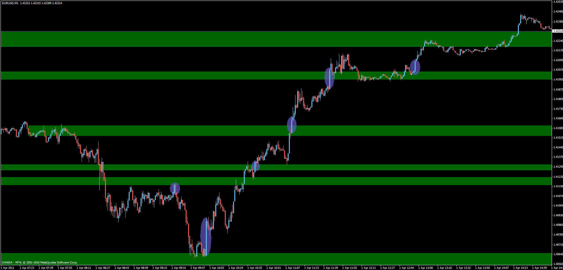
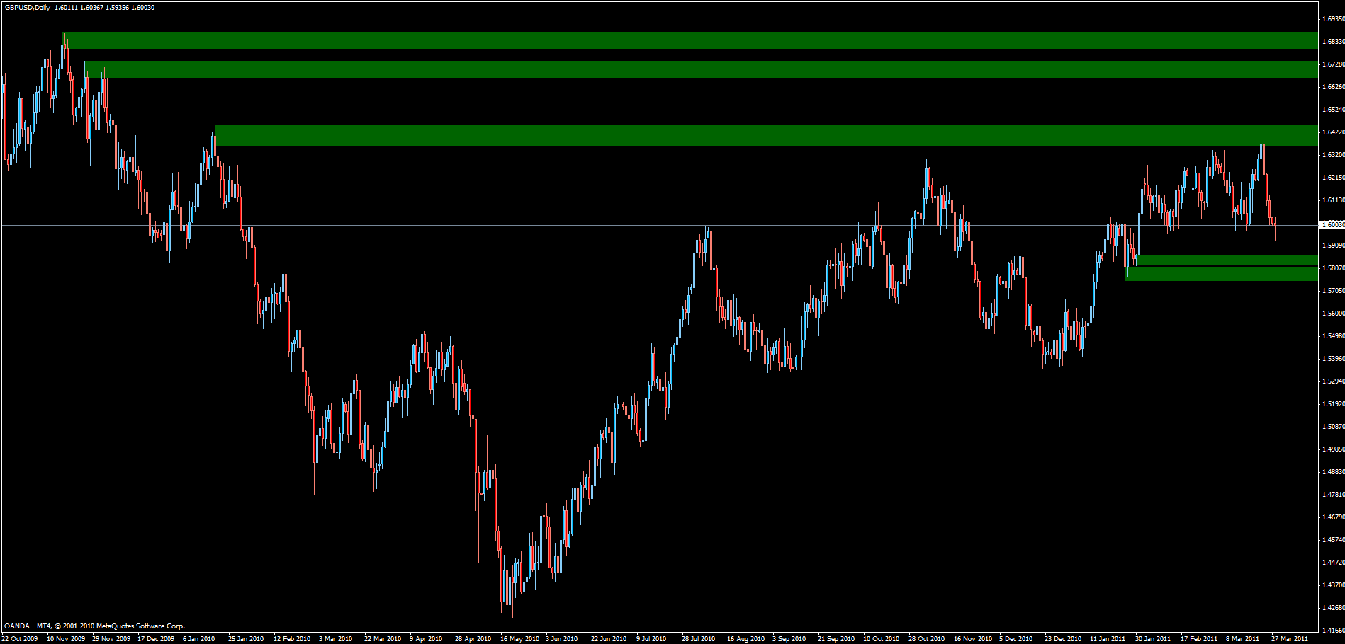
Now, I’ve quickly marked out some zones using the 15min chart, all the zones are from yesterday and one was created during the day.
http://i923.photobucket.com/albums/ad76/o990l6mh/ef02eef3.gif
Look at what tape reading, which is completely based on the concept of supply and demand, can do for you:
See how big bars are tell signs of what the balance in the market is when price reaches and interacts with previous zones where we know there were imbalances yesterday?
At some occasions price just blows through forming big bars, showing us that the marked out zone is no longer valid. At other times price breaks through and then retests the zones, reacting with a big bar again showing us which way the market is leaning. And at other times price reaches a zones and then bounces, forming a big bar showing us that there is still strong imbalance at the level.
What more can one ask for? This is all we need in our tool box to be able to trade consistently and profitably isn’t it? As for me, what I would need is time…
I’ve used 1min charts in this example but of course 2, 3 or 5 minute charts would be just as fine if not better.
I have no specific criteria for what constitutes a large bar, it’s just a visual assessment. I’m sure that could be improved upon with stringent criteria.
edit: the vertical red line marks London open
Yes, that’s a good observation. It does matter where price is when the big bar forms. See my post from today for an example of how to put it together in a useful way that still takes almost no time at all.
As for criteria on what makes up a big bar, I have none. I just eyeball it for now but that’s probably something that could/should be improved.
Not quite. (I assume you mean the short TF approach from the last few posts)
Before London open you go through the chart of whatever instrument you decide to trade, for me it would likely be EURUSD. Mark out the supply/demand zones above and below current price using a top down routine through the time frames, go down as far as to the 15min assuming the trading chart will be 1-3min TF. If need be, use the 5min chart to adjust the 15min zones.
Once that’s done, trading starts. This requires constant screen time which is a drawback for those of us with dayjobs.
Observe price action and watch for large bars to form in reaction to the zones you’ve already marked out. As soon as you get a trigger, such as for instance a large red bar bouncing off a supply zone, enter short with your SL just above the high of the trigger bar.
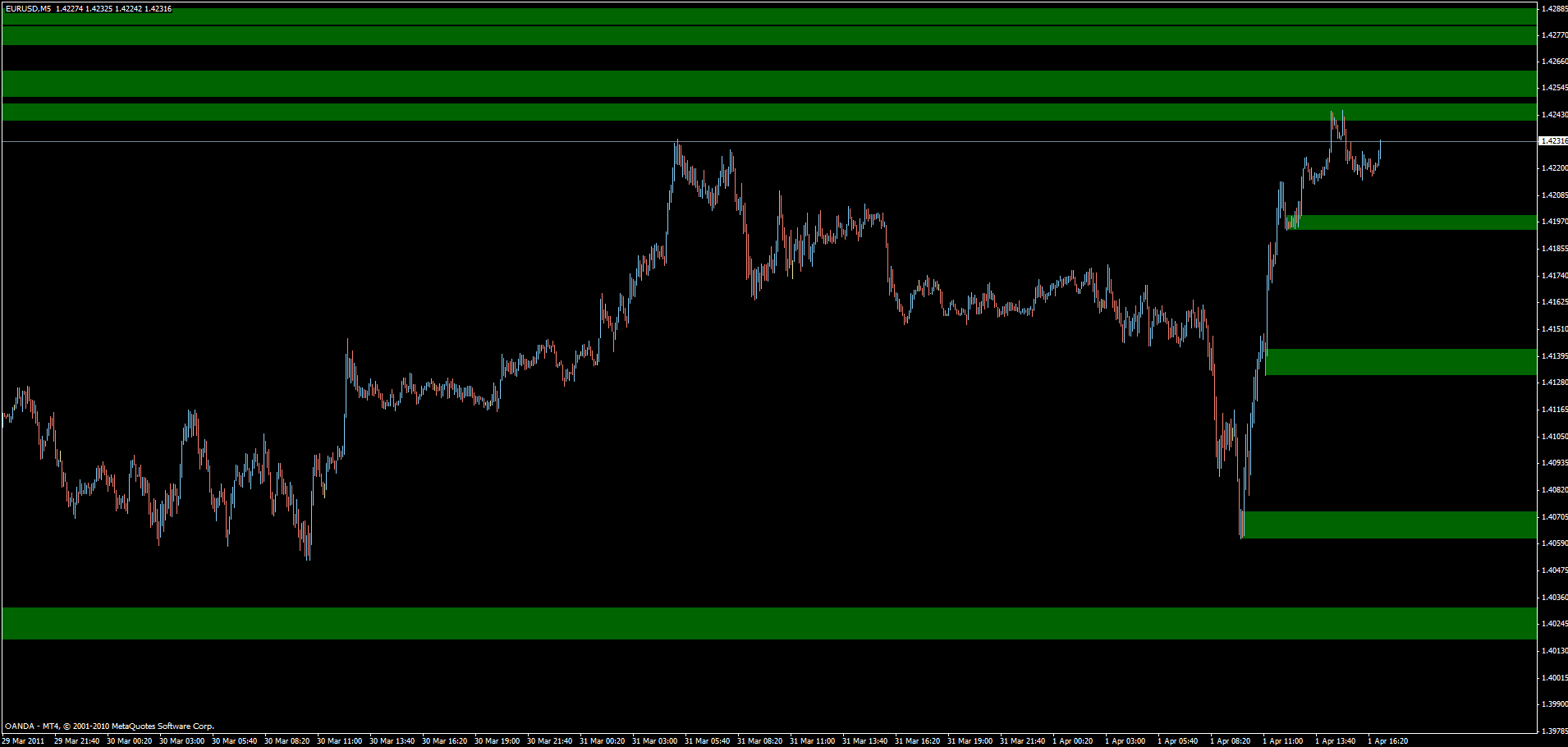
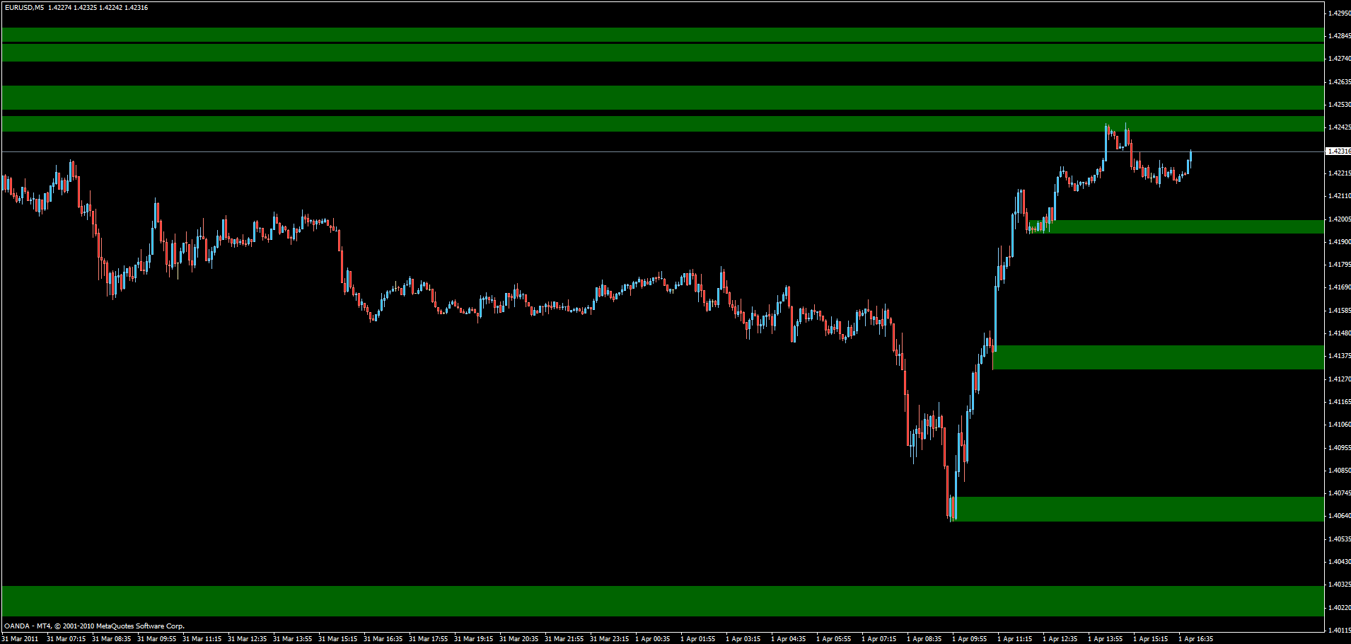
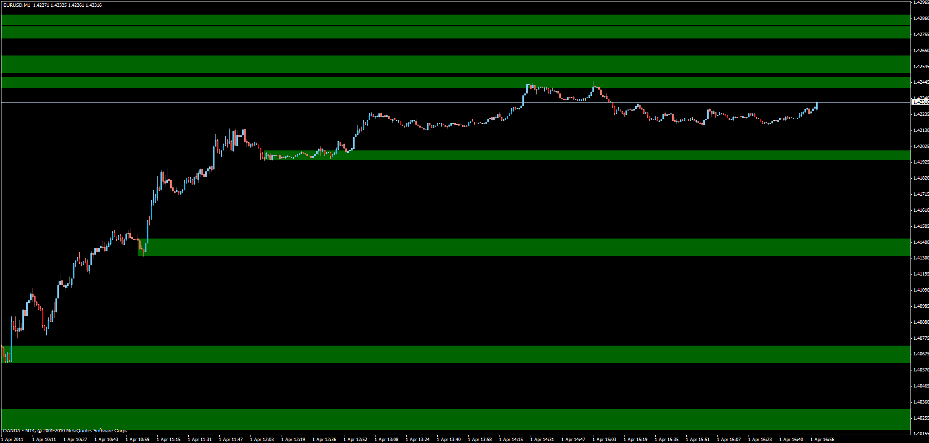
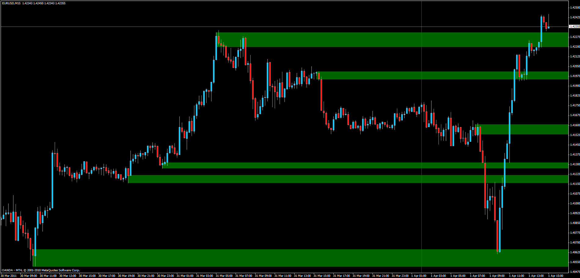
I’m going to go through EURUSD and post the 15 min zones I can identify, tomorrow night we can see how the 1min chart reacted to these and see if there were any triggers and if so, what would have been the likely result.
Here we go, these are all the same EURUSD chart from different views. This should be done as Asia is winding down, but instead I’m doing it now before Asia/weekly open. If I have time tomorrow morning, I’ll adjust the zones as required and post again.
Tomorrow night we’ll discuss what, if any, trades would have been taken based on how how price on the 1min chart reacts to these zones.
Charts:
5min zoomed out:
5min:
1min zoomed out:
http://i923.photobucket.com/albums/ad76/o990l6mh/2c0f2476.gif
1min:
I realized I can do better than to post a bunch of charts.
I’ve attached the template file, it’s zipped since *.tpl files can’t be uploaded.
It will give you a better view of the zones I’ve placed if you’re interested.
Mind, this is the before Weekly open version, not the before London open…
eurusd 1min zones.zip (1.08 KB)