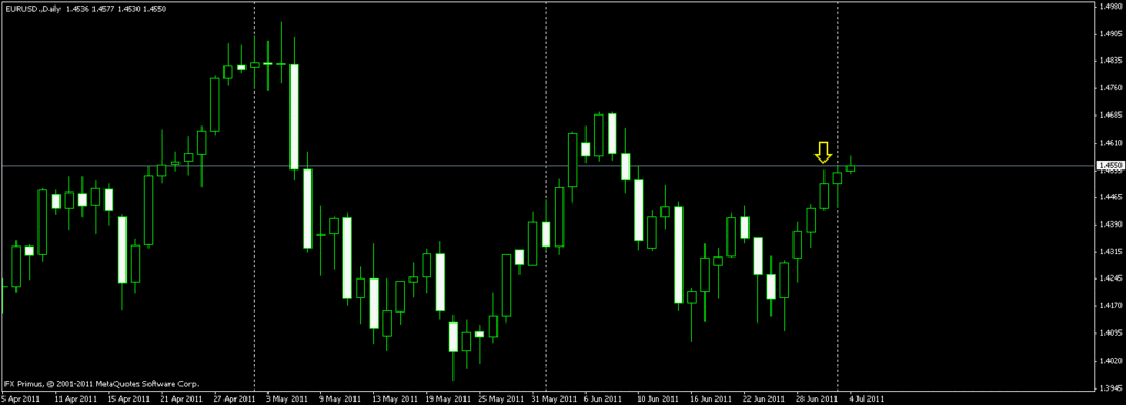
FX Primus.
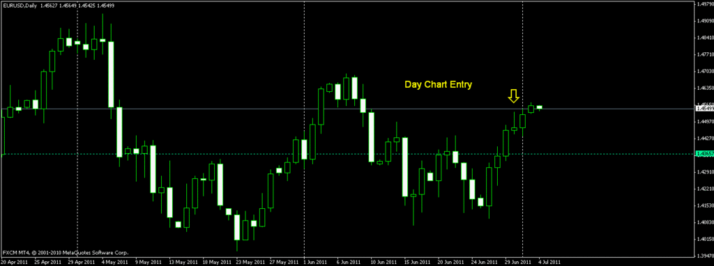
FXCM.

These are two charts from the MT4 platform.
One is from FXCM and the other is FX Primus.
The charts are the same as far as the H1 and earlier TFs are concerned. There is a difference of about two pips on the price levels but the total pip count per candle and all is the same.
Now the difference starts with the D TF.
If we are trading Candle stick patterns on D TF, then such a big discrepancy in the charts will be disastrous.
If you see the yellow arrow on both the charts you know what I mean.
I took a sell on the following day basd on the FXCM chart. I took 40 something pips and it went as far as 75 pips on a sell. But I assumed it to end as a bear candle and it would be a continuation of a sell today.
So obviously my chart reading was wrong as my chart itself looks inaccurate if I compare it with FX primus chart.
The FX primus chart has five D candles per week, FXCM has 6 candles. Futhermore, FXCM platform closes the candle at a different time compared to FX Primus.
I would like the input of senior traders in regards to this. Which is an accurate chart?? What time should the candle for the D TF start and close?
How do we avoid the near disaster like EU the other day??
For those who would like to see the trade itself please refer to
http://forums.babypips.com/newbie-island/39366-new-forex-trading-7.html#post266302
Post number 56. That were the charts I based my entry on.
Happy Pipping.
