Is this another correct way to draw a trendline? I saw this trendline demonstration on youtube, basically this is how it works.
First, I identify the various resistance and support levels and then marking them with a horizontal line touching the their highs and lows.
Then I draw a series of line connecting each succession high and lows for easier dissemination.
Lastly I simply connect a trend line from the lowest low to the most recent low. Thus this line is a �trendline�. The whole thing works opposite for a downtrend. Any comments would be much appreciated.
I think that’s an overcomplicated way to draw trendlines.
Trendlines are really easy to draw. You just draw a line along the higher highs/lower lows, keeping in mind that 3 or more points is a LOT better than 2.
B[/B] Why bother to go through steps 1 and 2 of your procedure? If you think step 3 produces a valid trendline, just go to step 3 and draw it. You don’t need steps 1 and 2 to tell you where the “lowest low” and the “most recent low” are.
Steps 1 and 2 produce what’s called a zig-zag, which is a totally useless indicator already built into your MT4 platform (look under Custom Indicators). If you want a zig-zag on your chart, the built-in indicator will put it there. You can vary the parameters.
But my suggestion would be: ignore the whole zig-zag thing.
B[/B] The trendline you have drawn is arbitrary. The lowest low, and the most recent low, are not necessarily the points which best define what the market is doing. Drawing a trendline is as much an art as a science, and traders often disagree on which line is the best trendline.
To my eye, the chart is suggesting the trendline I’ve drawn on your chart.
Note the outliers — candle wicks, and sometimes candle bodies, which lie on the “wrong” side of the line.
(Outliers happen. Don’t be offended by them.)
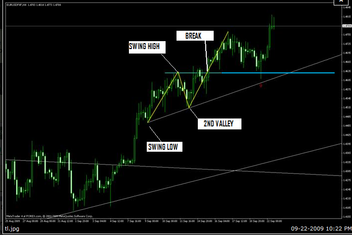
When drawing trend lines you connect the higher lows for an up trend. Note that when connecting the higher lows the high of first swing must be broken before the trend line becomes valid. In the chart posted below the high is the cyan line, after the market breaks through then we connect the lows. The yellow lines are not trend lines.
And for the down trend you connect lower highs, when connecting the lower highs for the downtrend the swing low must be broken before the line becomes valid. In the chart below the low at the cyan line had to broken before we draw the down trend line.
Swing Low was identified as the “starting” point of the “trendline”. A break occurred at the “break” point which is also at the “Swing High” Level which is the first peak after the “Swing Low”. So this confirms an uptrend.
The trend line is then drawn from the “SWING LOW” point and along the way touches the “2nd Valley” (So the trendline touches 2 points on this series of candles) This is opposite for a downtrend.