COT Report Analysis - a thread on market sentiment

Important is to compare it to its historical value, not only if it is positive or negative! Are you updating your database regularly?

Hi.

I am new here. And is reading about Market sentiment. I can not make the COT indicator at work. I try to put in the code for different currancy pairs. But it fail to reckognise it. I youse MT4. By the way

Hello.
I’m gonna revive this thread.

The COT report is a very helpful tool in determining the sentiment of an asset. And a smart trader would want to know as much as possible about which bias that asset is taking. The context, in which this report gives us clues, would be more suited for the swing and position traders. Meaning, those traders who depend on the longer time frames for the duration of their trades. The daily time frame and higher.

This report can be turned into some kind of market signal to tell you when you should be getting into a trade. Looking at and noticing some extreme positioning by the market participants can yield some good trading opportunities. But these signals are not a usual occurrence. I don’t know…maybe a few times a year you might see something.

But I believe there other primary uses of this data.
This is where I am coming from, and how I particularly view this.

  • It’s a macro view of a currency. I approach all of my trading first and foremost by looking at a currency’s aggregate (not pair by pair). A summary. An average. The total sum of all it’s parts (pairs).

  • It shows a bias. Kind of like a seesaw. It’s got to be tilting one way or the other. It’s the favored direction in which the big traders are positioning.

  • Establishing and keeping track of what that trend is. Eventually watching for trend changes.

This is what I believe is important.
All of this is nothing but information that I deem very important to know before I place my money at risk. It’s getting educated on what’s happening in our market. I believe it’s another piece of the puzzle (very constructive and insightful I might say).

Now. I don’t want to open up a can of worms and have to explain each and every detail about the report. You’re gonna have to do some homework on your own. In fact, that’s the reason why I chose to open this thread back up. Cause in the beginning of it, there’s some very helpful links to get you started.

FE has done a considerable amount of work on the subject. And guess what? It’s all right here for you to read. This is probably the best thread in BabyPips on the subject. You will not find any better explanations, conversations, studies on this stuff.

So again, let me say. If anyone wants to be apart of all this learning, you have to lay the ground work for yourself and get caught up to speed. I would hope most conversations would be revolving around the current sentiment analysis, as opposed to the basic workings of the report.

Now. Given all that. I am gonna talk to you like a new trader. Someone who has never heard of this. Hopefully this will interest you enough to want to uncover some of its benefits, and how you can make it work for yourself.

Let’s look at this. What is the report anyway?
2021-07-21_09-41-49

It’s almost like insider information. But the closest we can get to that is knowing what the open interest is. This is in the futures and options market. Not the Forex market. So, when we are looking at our currencies, it’s what’s going on in their market. It’s a clue, that’s all.

Let’s talk about what open interest is. Cause you’re going to see that a lot. Basically, in the futures and options market, a contract requires a buyer and a seller. That’s a closed contract. They have come to an agreement. And the market will be moved, to some degree, when that happens.

But see, that’s not always the case. You can have a lot of buyers come into the market, and also you can have a lot of sellers come into the market. Right? And that’s precisely what open interest is telling you. It tells you how many long contracts there are open, and how many short contracts are open, meaning that their not closed yet. This is what it looks like before an agreement takes place. And remember, that’s counting contracts not transactions. Big difference there. Think about it. Someone could potentially be moving many, many contracts, which is not the same as the amount of transactions taking place. That’ll be much less than the former.

So, you’re going to have :
— Many long positions that have not been settled. Called longs.
— Many short positions that have not been settled. Called shorts.

Open interest is a measure of market activity. When the open interest for the long contracts increase, that means the market participants are watching closely, in order to go long. Same goes for when the open interest for the short contracts increase. That means their watching to go short that asset.

Ok.
This is gonna have to do it for an introduction. Running out of time here for today.
I hope I stirred up some interest (get it).

Anyway. I’ll be back tomorrow with another lesson.
I just plan on explaining the important things that we should be talking about in here.
But go ahead and read some of the very beginning and get a feel for what we’re talking about.

I will continue on with this tomorrow.
Mike

2 Likes

Let’s continue on.

Here’s the BabyPips link.
Commitment of Traders Report - BabyPips.com
Just go through that, and you should get caught up to speed.

But, this is where it all starts.
Commitments of Traders | CFTC

Moreover, where would we go from here?
On the left side column, there’s the Commitment of Traders tab. Inside there you can scroll down and read about the 4 different reports. And the most favored report that we will be dealing with is the Legacy Report. I’m not too sure why we view them over the Traders in Financial Futures, cause you can find the currencies in both. But I’m thinking that following the Commercial and Non Commercial traders is most prudent. Those guys are found in the Legacy report.

As you scroll down further, you’ll be seeing the current reports, per their respective classifications. So, we’ll follow suit as for what BabyPips suggested. Current Legacy Report. Futures Only, for the CME exchange. That’ll give us the most recent raw numbers.

Well, I’m gonna say it.
This can be confusing stuff.
And that’s what my job is going to be here. To simplify the matter, while keeping with the way to track, monitor, and see these currency trend dynamics.

Last time I talked about open interest. There is the total open interest figure. That’ll show you what’s going on in the really big picture. It’s the sum total of all 3 groups (Comms, NonComms, Nonreportables) longs and shorts. You’ll find that if you add up all 3 groups’ longs, that’ll equal all 3 groups’ shorts. So when we talk about the total open interest number, it’s that number. Sure, it’s something to keep in mind and take notice of. But I think the specifics are more telling.
The longs and the shorts.

The longs will tell us how much buying interest there is. And the shorts will likewise tell us how much selling interest there is. Those are some important figures. Absolutely. But see, they don’t mean a whole lot unless you compare them to one another. Think of a seesaw. It’s gonna lean one way or the other. The longs are on one side and the shorts are on the other. Which way will it tilt? Well now we are getting even more closer to what’s most important (I think).

It’s called the net position. Now this is not shown in the report. It’s just common sense. If you have all of the longs on one side of the seesaw, and all of the shorts on the other side of the seesaw, then which way will it tilt towards? That gives us the bias between the two. Right?

And voila. That’s what we really want to know. Of course, knowing how strong that bias is, is very beneficial also. Cause when we keep track of that dynamic, we can therefore get a sense of the trend. Is it increasing or decreasing? Continuing or changing direction?

Now we are getting somewhere.
Look. I’m sure we could come up with many different aspects from the report. But what I’m doing, I believe, is the most simplest. I, surely, am not going to be accused of over analyzing this data. By far. I mean, all I want to do is find out which way the seesaw is tilting? Meaning, which way is the bias? For long or short? And then, to follow up with that with the degree of that. How much of a bias? All put into it’s proper context.

Remember what we’re doing here. This is a sentiment indicator. It’s being able to see how traders are positioning themselves. And when you keep track of that sentiment, watch how it changes, you can get some sort of answers.

Well, what I want to do is show you how I am compiling up these numbers. I’m only dealing with a few of them.

  • Total open interest
  • Total longs
  • Total shorts
  • Net position

So, I went ahead and compiled the YTD totals for the 8 currencies I track. Believe me, there’s much information I can gather just by charting those. Let me show you.

The USD.
2021-07-22_16-19-49
Self explanatory. Each week shows those 4 things I just mentioned.
What I believe is the most important and telling, of the data, is what’s on the right most column. That’s the Net Positioning. All that is, is the Longs - the Shorts. It’s which way the seesaw tilts, between those two.
— Negative = Bias is bearish.
— Positive = Bias is bullish.

The next most important part of the data, I believe, is the very next column. It’s the red or green column. That is whether the sentiment went either positive or negative since last week. The current weeks Net Position minus last weeks Net Position (all on right column). Basically, did the sentiment get stronger or weaker? Green for yes, it got stronger. Red for no, it got weaker. Look. 11,257 - 7,569 = 3,688.

I guess I forgot to mention a very important thing.
I am following the Non Commercial longs and shorts.

So then, you see my columns of shorts, longs, and then the total open interest. That’ll be the total interest for the Non Comms.

This all gets charted.
2021-07-22_16-43-58
Green line is the longs. Red line is the shorts. White line is the Net Positions.

2021-07-22_16-45-03
That’s the total open interest.

Well, there’s so much to talk about there. I’m trying to restrain myself. Cause I can go on and on about what it’s all saying. Trust me, there’s a narrative to what’s happening in the market.

I’m running out of time, again.
Well, I guess I got one more day before the very next COT report comes out. And since we all have read and got caught up on everything, we all know that the report comes out on Friday’s. At 3:30 pm ET. We’ll get to see how the market participants were positioned as of Tues of this past week.

But I guess I did end on a good note there. That’s just the USD.
I would like to go through all of the other currencies and give a bit of narrative behind what’s going on. And then when the fresh numbers come out, we can compare and see what kind of changes are taking place. If any.

I would also like to compare this sentiment data to other currency trend indicators.
Basically, are things agreeing with each other?
Are trends continuing or changing?

There is a lot we can talk about.
But I’ll be back tomorrow and try to wrap up all about how I’m doing this.
Also to have a good narrative ready to be compared to the new data that comes out.
Of course I’ll be there when the numbers come out, and show them.
Then whoever wants to chat about all of that, I would be very pleased to talk about it with you.

Mike

1 Like

Hello again.

So, what do we got…
The COT report will be coming out at 3:30pm ET today. Then what?
Well, this is what we used to do.

Normally, whoever is watching closely (like me) will go to the site. And in whatever fashion it takes, it’ll be nothing but retrieving the numbers and inputting them into your own spreadsheets. That’s all. And then commences the analysis.

I don’t know about you, but I think it’s a great time when they come out. I’m aware of the elephant in the room. But, you got to get passed it. I’m talking about the time delay factor. Us traders know that the market can digest and implement fundamental type of news very fast. I’m talking…very fast. You guys remember the times when Trump would tweet something and the market moved like that? Boy, what a frustrating time we went through, those 4 years. In that respects, yeah, it was very frustrating.

The point here is this. You can’t be quick enough to be on top of a market moving piece of data. Unless you’re a computer and are programmed to act in milliseconds, you can’t compete. Of course, you know that I’m talking about day traders. But the thing of it is, what really moves the market is not the day traders. It’s the big money. It’s the institutions, central banks, etc… that take their time, come in the office at their leisure, and commence their operations of making their money flow according to their plans. Their called the smart money.

I believe that smart money is patient, methodological, purposed, and, well, smart. If they really want the market to be moving in the way they want it to, they have to be tactical in the way to do it. You unload great amounts at the right times. That takes time. Think about it. They are not operating off of emotions, and at every sharp turn the market could take. Have you ever seen a daily candlestick be very long? And then on the very next day, see that daily candlestick turn 180’ right around? Take a guess who’s behind that? Their turn has come and they get their work done.

I believe in this principle.

— The daily time frame is the most important time frame.

There is more to that. On the shorter side of that, you’ll have each of the three sessions working. Asia wakes up and gets to work. They do what they do. You know that they, first, have to know what the US did when they were at work. A lot of times you’ll see they follow suit of what the Americans did. They’ll see where the highs and lows have gone. They take note of that stuff.

Then the Europeans wake up and need to know what the Asians have done. How they have moved their money around. And then they get to work and do what they do. The same goes for the US players. They need to know what’s happened in just the previous session. Meanwhile, everyone knows that there are bias’s of their own respective currency. Whoever is in session, there’s a good chance that their currency will move much more than when it’s not their turn. No one (and I mean no one) moves the GBP more than the Brits themselves.

Anyway, to see a little further out, from the daily time frame, we have the weekly time frame. This is important. Yes, the daily is most important. But seeing what happens in the context of a week is also important. I mean, this is the only time that we have a break in the action (actually, in the Forex, it doesn’t stop but continues on. The brokers all must take the break and then resume at the open. Why do you think there are gaps?) Nevertheless, there’s a break in the action. What happens in a weeks time is crucial in the search of knowing where trends want to do.

You will not find a better context in which to ascertain which direction the market wants to go in. For as difficult it is, and almost impossible, to judge what a true trend is beforehand, this is the best we can get. It will be on the higher time frames. Of course, in hindsight, everybody learns what the trend was. It’s only in hindsight.
Remember that…we’re all genius’s when we look back on it all. But not beforehand.

The daily time frame is most important. Also what happens in a weeks worth of time is just as important.

Now. Let’s bring this back to why we’re here in the first place. The COT report comes out on Friday late. Only an hour and a half before the market closes for the week. And the data that we’re getting then, is what was on Tuesday. I’m not sure if it gets computed on that EOD or what. I don’t know. We just know that this is how every market participant is being positioned, as of that Tues.

Ok. So we get this data like 3 days later. Yeah, bummer, no doubt. But you got to remember what I just told you. We need a little patience. A couple days later, surely, is not going to make such a big difference. At least we’re still dealing with what the market participants were doing in the same week! That’s definitely a plus.

Remember, real trends can last for a very long time. Days, to weeks, to months can go by doing the same old thing. Just take the JPY for an example. This entire year they’ve been sold more than anything. If you were smart, you could have seen all their trend being confirmed by the COT report. And then we have the GBP. Same thing, this year, but being bought up. I’m sure the report would show and confirm their trend as well.

As I have stated, you can use this report for a confirmation of a trend that is taking place. Like a confirmation indicator. Sure. Why not. You just stick with a buying of a currency, or a selling of a currency. And then pick one currency that is biased one way with another currency that is biased the other way. Hence long & short. And that’s what we do here in the Forex market. We’re looking at 2 assets, not one, at the same time. One is going one way and the other is going the other way. In hopes of finding that relatively correct moving direction.

How about using this report as an indicator for a trend change? Trends do change. This is a way to see how it’s changing.

So, you new traders that come along and think this is interesting, you got to keep in mind, in regards to your trading, you’re going to have to realize this can potentially benefit you if you hold onto your trades for longer, not shorter.

Then again, all this can benefit you in a slightly different way (like it does for me). And it’s a way that doesn’t have to do with trading, directly. You’ll find that the older traders (cough Peterma cough) and those who are market smart need to be keenly aware of what’s the current market sentiment is. A lot of those traders will be looking for the big opportunities, in which don’t come around so often. I would like to think of myself as being in this camp. Cause I don’t look at the market for the sole purpose of finding a trading opportunity. I’m curious. I’m fascinated when things move. It’s interesting! It’s not always about making money, it’s our field! It’s what we need to know, what’s going on in it. That’s all.

This is a tool.
Let’s look at some narratives (before we get the latest report that’ll come out soon today).


Explanation of the charts. On each currency there’s 3 lines. A red one, green one and another bigger one. The red and green (thinner ones) are the longs and shorts. The one thicker line is the Net Position. It’s the line that tilts the seesaw in the direction of the bias. And that, of course, will either be for strong (long) or weak (short).

So. I’m gonna give you a quiz. Take a look up there at each one. Just look at the thicker line. That’s the most important one (as I’ve just stated). Which two currencies have been trending higher?

Meaning, their open interest longs have out weighed the open interest shorts.

Meaning, their most current bias should be pointing higher.

  • USD
  • JPY

All of the other ones are not pointing higher. What does this tell us?
Well, we can call it more of a risk-off sentiment. Risk aversion atmosphere. Although the CHF is not necessarily matching that (cause we know they are a safe haven currency also).

What else can this tell us?
The USD is paving the way, with the JPY following suit (which is a normal dynamic). Maybe just a by product of what the US is doing. So we could simply be seeing the fundamental happenings coming from the US taking precedence in the market. We do possess the worlds reserve currency. So, all I’m saying here, is that the fundamentals could be driving the reason. That’s all.

What does that leave all of the other currencies?
Most of all of them are pointing downwards. With the NZD as the exception.
Look at the Europeans, the top three on the right. I think that’s interesting. Huh?

And then we have the Comms. Bottom three on the right.
The CAD surely has taken a dive. In the context of the entire year, they were at a high plateau place. Well, if you ask me, that seems to be changing.

While I’m here, let’s keep with the CAD. I want to point out these other dynamics that we are looking at. The other lines.

Look at the green line. That’s their open interest longs. What’s been happening here? It’s really have been coming down. What does that really mean? The buyers are not buying anymore. Well, more specifically, the amount of open long contracts have diminished greatly. They did level out for a short time, but now seems like continuing lower.


Sorry. Need to throw it up again (so you can see as I’m writing).
Now, what has been happening to the shorts? Look at the red line.
As the longs have been diminishing for a while, the shorts were diminishing also! How does that happen? Probably the total open interest has been coming down. We’ll take a look at that shortly. But look at the most recent action on the red line. It’s climbed up. Meaning the shorts have been increasing. And that of course will be the main cause of the downward pressure on the currency. So basically, they’ve been getting hit from both sides of the equation. That should indicate a more greater purposeful move.

Let’s look at the total open interest. Any indications here?
2021-07-23_12-30-15
Well, we can say that it came off of an extreme that occurred this year.
But then it leveled off.
During that leveling off period, the net positioning did fall off (as we’ve just seen).
That tells me that the amount of activity, for the CAD, is keeping steady. It’s not really falling, or rising either.
I guess I need to put all them together, to see what’s been happening when the open interest was rising all that time during the middle of the year.


Well look. I don’t know. I’m sitting here looking at this and the only thing I can really come up with is that the open interest got so high that it needed to correct. It couldn’t sustain that height. It’s probably something really out of the normal. But that drop is something though, huh?

I guess a further investigation into previous years worth of open interest data would help explain that level (don’t need to tell me twice…I’ll do it).

Anyway.
Let’s talk about something else.

If you look closely enough to how the longs & shorts lines (green, red) are in relation to each other, I think there in lies some clues. Let’s take the NZD for example.

2021-07-23_13-37-05
Around week 11 there was a major drop. What caused that? It was the diminished longs. Not an increase of shorts. Know what I mean? There’s a difference.
I would say that the bulls pulled back. Could we say that the bears took over? No way. You can’t say that. But what we can see here is that most of the changes are coming from the bulls. Not the bears. I’m just talking about the difference between those two lines.

Look. I’m not expert. If there is one out there, please, by all means come on in here and do some explaining. I welcome that, whole heartedly.

But continuing to look at the NZD, it will be interesting to see whether that Net Positioning will drop back down. If it does, then guess what? The trend will be continuing. Also to boot, will follow the other Comms on down (if that’ll continue to be the case).

So. Not only is this interesting, but in regards to trading. I don’t know about you, but if I see some NZD Net Positioning turning lower, then I’m gonna keep with my bias of a short NZD. Cause that’s what the trend has been. You can’t argue that. Right?

And on the other hand, if it goes higher, well then, I will be extra careful with them. That’s all.

While I’m here, let’s take a look at the AUD.
2021-07-23_14-06-42
When I first look at the chart, this is what I’m thinking.
First, I look at the big line (net positioning one). That is definitely bearish. Has been. Actually, do you realize that it’s in the negative? There is a difference between that residing in the negative territory and the positive territory. I think the difference is, that’s it really has a negative bias. As opposed to being in the positive numbers and heading lower. It would still be considered bearish, but residing in the positive territory.

What else? Well, I see that (keeping with that N.P. figure) it’s at the lowest since the year started. That’s pretty extreme, wouldn’t you say? Maybe not in regards to other previous years, but we’ll have to dig that up sometime.

Now. Take a look at the red and green thin lines. Have you noticed how much they have diverted lately? Like more than at any other time this year so far. Man…this is telling. Let’s be more specific. What’s happening there? The longs (bulls) have been dropping out lower. Little choppily I might say. But look at the shorts (bears). Now that is on the rise, significantly. Presently at the extreme for the year. This is quite high.

Well, I would have to say this is something to be watched. That’s all. In the meantime, we have a short bias going on. When the new data comes out, we just see what more it wants to tell us. I’m trying to give you the narrative of what’s been happening with them. All we want to do is add onto the story.

Will it continue?

By how much?

Any indication of change taking place?

Those are some questions I will be gunning for. It’s the rest of the story.

Let’s move on.
The JPY.
2021-07-23_14-32-20
We have the Net Position sitting in the negative territory. No surprises here. Right? But it is turning up. Well, I should say that the last week made a turn higher. They did follow the USD.

Step back and see that this figure started out the year way in the positive. But also note that the bulls were more in demand than the shorts were. The green line was higher than the red line. But of course that changed. The shorts took over and those bears dominated over the bulls.

Look at the green line. That’s the bulls. The amount of bullish open interest wasn’t (hasn’t) been changing a lot. Steady it goes. But don’t look now, but that seems to be rising. It rose up to the 40,000 gridline. It hasn’t been this high for awhile. We’ll just have to see whether that line catches fire and wants to go higher. Also take note of the shorts line (bears). It just started to slant down. That’s one week in a row. Will we get two weeks in a row?

Stay tuned.
I’ll let you know.

The CHF.
2021-07-23_14-45-23
We’re looking at the buyers, sellers, and the nets. Green lines, red lines, and the Swiss line respectively.
The Nets have been coming down, the last 3 weeks in a row. And what explains this is that the shorts have been increasing, mostly. Sure, the longs have diminished some, but not by a whole lot. Actually, they’ve seen much, way much more, lower long positioning amounts. So I guess it’ll be the bears who are getting stronger more than the bulls who are getting weaker.

If you ask me, I’ll just blame it on the SNB. That’s all I’m good for with these guys. So I’ll just say that that red line (shorts) are the SNB. Somehow they are able to over power the greedy, safe haven bulls. That’s all.

But realize, also, that the nets are in positive territory. That means something. I think of it more as a bullish bias background, say, that’s on a picture canvass. See how they bounced back up earlier in the year? It’s because the bulls remember way too vividly how they think they belong on higher. And it doesn’t take all that much to make it that way. The green line (the longs) were already elevated up in that territory anyway. I think the SNB just lost their grip.

Anyway. Just remember that we are in the positive, and that needs remembering.

The GBP.
2021-07-23_15-00-15
Well, the nets are definitely in the positive. All year. But let’s see, in the last 4 weeks it’s been moving lower. I’m wondering if this is turning into a new trend (from high to low).

Well, what’s the other lines telling us?
The bulls (longs) are way much more than the shorts (bears). It seems like we’re losing the bulls moreso than gaining the bears.
We also need to see (moving forward) whether the shorts (red line) gets up higher than the longs (green line). If so, I would say that the bears would over power the bulls and dominate. See, that’s a dynamic that needs paying attention to.

The EUR.
2021-07-23_15-06-41
Same thing here. In the last 4 weeks they’ve been biased lower.
The shorts (red line) have increased way much more than the longs (green line).
It’s all in the positive territory. They’ve (along with the GBP) have been very strong this year so far.

The USD.
2021-07-23_15-09-17
This year, moved from negative territory into positive territory. And lately, got a boost majorly.
The longs and the shorts were running quite close to each other. Meaning, no one really is dominating. But look at what happened recently here. The shorts have lost out to the longs. Meaning, those who want to be short the USD sort of gave up. Cause it surely wasn’t the longs who over powered them. The shorts stopped. Gave a breather. Therefore the longs ended up being on top. Which made the net positioning move up higher.

Well, remember, we’re in positive territory. Don’t count out the USD just yet.

I can’t believe the time.
We got 15 minutes till the latest COT report comes out.
Sorry I took so long with all this.
I’ll come back and give some notice of what happened.

Mike

2 Likes

Hey Mike,

I am happy you are here again and made the thread live. I have not read your last post yet, but I am on it,

I have a little issue, I checked the first post, none of the links work anymore, I do not understand why. I might PM one of the moderators to find out what is wrong.

I am looking forward to see your next analysis.

FE

Hey Mike,

I see peterma gave you a like. It would be amazing if we get him somehow to be active here again.

I must admit my knowledge in the report went down a bit, but the time invested once is not lost as it comes back quickly.

So I have a comment on your post where you mention we follow the “Non Commercials”. Here we need to dig into if we really do it. Non commercials are the trend followers and obviously you want to find the trend.

But you also wrote about smart money and to me it is the Commercials who have the smart money so it is good to be aware what they do.

Now, peterma, it is the time when you should return to us. You know more than any computer and can help us speed up again!

FE

2 Likes

Hi FE,

Mike posted a very well researched update on his journal yesterday - very much worth a read and if I may say so a very professional work.

. My journey journal…from demo to live…and beyond - Trading Discussion / Trade Journals - BabyPips.com Forex Trading Forum

Me - I’m now nearing official age for retirement (14 weeks to go) so taking things a little easier :slight_smile:

2 Likes

Hey guys.

Is great to see you again!

Peterma…you’ll always be my hero. But if it’s time to take it easy, then so be it. I’m so jealous. But I’ll always believe that those who have reached that older age will have deserved all the retirement that they can get. I’m so very happy for you. Just keep in touch every now and then. You are loved.

FE…thanks for coming in!
'Bout time.
Let’s get some work done!

Look. I’ll come around on some of the issues you brought up (smart money…Comms). Although I might have used that word in a different connotation, but I’m not against the notion of exploring the Comms’ numbers. Absolutely. I just wanted to start out small.

Well, now that I’m back and am allowed to post something again, I’ll have to show you some interesting stuff I uncovered.

Alright. Here we go.

I was curious. Concerning the currencies. Just how much of a sample are we getting just by looking in the CME part only?

Here’s the site link.
Commitments of Traders | CFTC

Then, if you scroll on down you’re gonna be seeing the different reports. It’s gonna look like this.

2021-07-26_06-25-15

And so, as Babypips has shown us (but didn’t explain exactly why), you then would hit the CME one in the Legacy Report (it’s the second one down). Then you would hit the short format. In there is the current figures. Ok. That’s nice. Great.

But I thought…well, are there currencies elsewhere? And if so, what are they saying, also? Think about it. How much of a sample of our currencies are residing there on the CME, is that the total of them? Are there more?

Well, I went down through each and every one of those exchanges. And guess what? The only currency COT data to be found is on the ICE Futures U.S.. (Also on the above TFF Reports. But I’m saving that for last.)

But, the only currency stated there on ICE is the USD Index. And that’s what I use for the USD. But other than that, there are absolutely no currency’s in any other exchange. Ok. That puts my mind to rest on that. Now I know.

But let’s go up above to the Traders in Financial Futures Reports. Yes. In there is the currencies. And I have been going into the Futures Only group. As stated up above that, there’s 4 groups in that.

2021-07-26_06-43-06

Well, like I said, I’m curious. And I’m not lazy. I want to know to what extent of the data that I can find on my currencies. So, what classification do you think I would want to look at? Well, if you ask me, I think the second group Asset Manager/Institutional one is most helpful. I mean, that’s us, isn’t it? They trade like we do. And that’s also the reason why I started out going with the NonCommercials, in the Legacy Report. Cause they are speculators, trading like us.

I’m gonna make this a short story. I compiled all this data, in which I’m calling it the A.M. data, and also I compiled the other currency data, in which I’m calling that the NonComms data. I went back, for both groups, from 2019 up to the present (2 1/2 years worth).

This is where it gets interesting. I’m gonna show you all these results.


This year. 3 lines. Green = open longs. Red = open shorts. Solid = net position.
What I think is interesting, in the comparisons.

  • The NONCOMMS all have a greater amount of contracts. Basically, many more traders transacting there.

  • The USD — the A.M. are decreasing their longs as opposed to the N.C.'s. They have increased their open long contracts.

  • The EUR — the N.C.'s shorts seem to be increasing much more than A.M.'s. Also those shorts are almost matching the same amount as the longs. Compare that to the A.M.'s. No comparison (big separation).

  • The GBP — the A.M.'s net positions have been in negative territory. The N.C.'s have for the first time entered negative. Also you can see that the A.M.'s shorts have outweighed the longs a few weeks ago. But just this past week did the N.C.'s cross.

I think the question we should be asking here is From hindsight perspective, who ends up being more correct, in following the trend? Or maybe Who should we believe more, if they differ?

Concerning the GBP, I think the A.M.'s data seems to be more predictive. Cause they’ve been negative longer, and at the present time, they are continuing that way. Know what I mean?

Let’s move on to the others.

  • The CHF is starkly different. The A.M.'s net positions have been negative all year (hence negative territory). The N.C.'s have been positive all year. What a difference! Now what do you make of that? Know what I think? I think you can make a case for both sentiments. Mostly bullish bias, and a mostly bearish bias. It just depends on how you are looking at it (I know…sounds like a lot of talking out of my butt).

  • The JPY N.C.'s have been less bearish than the A.M.'s. Cause the net position line on the bottom doesn’t continue on down lower. The top is. Well, in the second half. I think we need to ask the question of whether the JPY will reach up and over into the positive territory before the year ends. And if so, which group will see it through first?

The Comms.

  • The AUD are both showing in negative territory. I’m not seeing a whole lot of difference between the two groups. Maybe the A.M.'s more bearish (cause their longs are not increasing like the N.C.'s are.

  • The NZD have differed, in that the A.M.'s net positions are in negative territory, the N.C.'s are in positive territory. That would (should) mean that the A.M.'s are more bearish. Right?

  • The CAD are quite similar. Positive territory for both. But the A.M.'s might be more bearish (cause the lines seem to want to cross sooner).

Alright, well, I think this is interesting.
It’s what I’ve uncovered so far.
But FE, you made me think. Therefore I’m gonna investigate into the Commercials.

Looks like I need to make these posts count (get out all that I can on each one or else I will be locked out again).

And BTW…if any new trader out there think this stuff is interesting, or have questions, please feel free to fire away. But remember, this is just a sentiment tool. It’s not a trading tool. It just shows us what’s the feeling and where the positioning is at concerning our currencies.

If you ask me, concerning trading, over the years I’ve learned that you can learn so much more about trading if you just do one thing. Hold onto a trade.

You want to see some profits? Do that.
You want to be in a better position when dealing with when to exit? Do that.
You want less aggravation regarding all of the decision making you have to do? Simplified trading? Do that.

Just remember, this data has to do with the longer standing time frame trades.

Talk to me.
I’m here.

Mike

1 Like

Hey Mike,

I am reading what you write, great stuff. I have to admit I just cannot go into so deep analysis in the topic as you do at the moment. BUT it does not mean I cannot try to help so we can manage this together.

I have a suggestion. I am reading your post number 4336, I am about half way through. My suggestion would be to somehow put together your analysis on one picture with price action. Do you remember how we did the COT Index? I mean something like that. I would be easier to understand the moves and what happened at the extremes if we would see price action reactions at those points.

What do you think?

FE

I hear ya FE.

Trying to think about how to do that.

Cause you’re talking about price action. And that has to do with a particular pair.
Ok. Sure. USD/XXX pair. But I deal mostly with the aggregate. Which means that I look at all 7 pairs of a currency and combine them to give one aggregate result.

But let me think about this. Cause there’s a principle here that you’re talking about.
Which is, to compare how the market moves in real time, alongside the COT data that we can match up with during when the market moves.

It’s the old cause and effect dynamic. I got ya. Like to see an extreme and take note of how the market moved shortly thereafter.

But then again, we got to put that word extreme into the proper context. Cause the extreme of what this year shows is not necessarily an extreme in the last so-many-years worth of data.

I’m thinking on that FE.
Thanks.
Mike

1 Like

Hi Mike,

I started reading old notes and things are coming back. So, for jumping into ongoing trends, we follow the Non-Commercials (also called Speculators). Commercials are good to follow at large trend reversals. Non-Reportables are individuals who usually lose, so it is safer to be on the opposite side.

The difficulty I face is that timingcharts.com website does not have anymore the free service for a COT report analysis. I always used their tool to spot easily trend reversals and entries. I am not sure if there is any other website like that, it would be good to figure out somehow. It would be definitely time saving.

FE

Regarding your question about price action: we have to bring price action into the picture because after all we do our analysis for a reason. And this reason is to see how price action reacts to our findings.

We used the USD charts as those net positions were measured vs. the USD. I hope this helps to see which charts we use.

Balazs was the master of excel and I wrote him if he could look into the thread to speed up things.

FE

PS: I have a surprise for you, Mike. As you are a numbers guy, I checked what is the time frame people use usually when checking net position historical data. It is 3 years. So if you check only 2021 data - well I do not say it is wrong - but it is too short term. It should be 3 years to give enough information to compare. In COT Index we indeed use half a year.

Hello.

Let’s take a look at the latest COT report.
FE, I’ve definitely taken into consideration all of what you said. All week. And so, this is what I got so far. It’s gonna be a rough layout, but until I get something standard going, this is gonna have to be what my analysis looks like.

This is going to be the data that I am collecting.

— The 8 currencies found in these reports :

  • The Non Commercials - Legacy report
  • The Commercials - Legacy report
  • The Asset Managers - Traders in Financial Futures report

So. Looks like 3 years it is. And I guess that’s a good place to start with. Big picture view. And then I’ll bring it in closer as I make my way through it all.

3 lines. Green = longs. Red = shorts. Solid = the net positioning. Black = total open interest (applies to the noncomms and comms only, which are equal)


4 currencies here. The purpose of this view is just to be able to see if there are any extremes. Extremes from the last 3 1/2 years. And the only extreme I see here is coming from the EUR, from the open interest amount. Let’s take a closer look at that.


More specifically, we are coming off of the open interest extreme.
What can we say about this?
Well, the open interest has been high in this last year (comparatively speaking).
Lately, the shorts have been increasing, in which has been causing the net positioning to drop more negative. See the trend lately?
I guess we need to further investigate this. The EUR.
What has been going on with them.

Here’s a close-up of the 3 reports.

The trend has been continuing downward, albeit, at a much slower pace than the last 2 and 3 weeks ago. But, in the first 2 groups there (speculators) the shorts are increasing and the longs have been decreasing. You have to see that. That is the cause of why the net positioning is ending up moving negative.

Mind you, all I’m doing here is looking at what’s been trending. For the moment, that’s it. That’s been the sentiment. I quite don’t understand that, but that’s how the numbers are turning out. I kind of thought the EUR has been more bullish of a currency than bearish. And why?

Now, let’s turn to some price action (cough FE cough).
This is aggregate price action. It’s what’s been happening in the market. I believe this is the best way to compare how the EUR has been moving alongside what the report comes out with.

Looks like I’m going with the context of June 1st, up to the present (above table).

Ok. That’s the EUR aggregate running pips from Jun 1st. That is how the EUR has been moving, on a daily basis, since then. Aggregate means if you add up all the pips from the 7 EUR pairs. It’s the net amount. And if you ask me, moreso for July, the EUR has been trending bullish.

How about this for a comparison. This is the best I can do.
2021-07-31_10-48-29

The dates are completely matched up. For the running pip count I stopped at EOD the 27th. Which was last Tues. I should have put Jul 27 there. Just know that it is.
This is unmistakable.
The shorts (red line) has been increasing more most of these 2 months.
The longs (green line) hasn’t been moving much.
The net positioning is resulting in an increase of short open interest contracts, this whole time.

Well, I can’t explain that. The correlation doesn’t seem to make sense.
How can the EUR’s movement be more bullish, meaning being more bought up, when the open interest short positioning have been increasing during this time? You would think the open interest for the longs would be the case, but it hasn’t been.

— Is the timing off?
— Are we not looking at who’s really moving the market?
— Should we assume the opposite? Like, when the shorts are increasing it means that the EUR is bullish. And when the net positioning decreases it translates into a bullish moving EUR.

I don’t know.

But, FE, you are the one who wants to compare price action to the COT report.

I’m more interested in seeing what the current sentiment is.

  • What’s the trend?
  • Is it continuing?
  • Is it changing?

And yes, sure, we should compare that to how the currency is moving in the market.
Therefore, we should be looking and noting the 2 dynamics.

Well, we need to be looking at another currency.

How about the GBP.


We got the latest figures at the bottom. This is how I view it.
— COT asset managers — Net positioning went more positive than last week (green). But the positioning is negative (means it’s bearish, because the shorts outnumber the longs… by 21,994 contracts).

— COT noncomms — Net positioning went more negative than last week (red). This is a differing view than the A.M.'s above. But, the positioning is negative (-5684). That matches the other. Actually, this is the first week that the positioning has entered into negative territory. The A.M. has been in negative for awhile now.

— COT comms — I guess this is where we can talk about the total open interest. That has decreased since last week. Interesting. Signify anything? Well, only that there’s been less activity happening with them than last week. And concerning the net positioning, the commercials are continuing their trend of having more open long positions than short positions. That’s nice, whatever that means, cause I really don’t know, other than the fact that they seem to be on the opposite side of the speculators.


That is the table, up there, but going back the entire distance. No extremes.

I guess all that’s left is to do the comparison.
2021-07-31_10-39-52

Again, it’s the 27th of Jul that both of those charts go to. Last Tues.
And just like the EUR, we have a bullish moving aggregate GBP pip movement going on in the market. And when it does retrace for a couple days it’s not by all that much. But, what’s the net positioning telling us? Bearish. The shorts have been on the increase lately. And the longs have been decreasing. This just does not point to being bullish. I don’t understand how these 2 charts can be telling 2 different stories.

We’ll need to keep monitoring this, cause if we’re dealing with a very lagging COT report indicator, I just want to know, that’s all.

I just need to ask the question again.
Why are we looking at this market sentiment data again, when we seem to get a more accurate sentiment just by looking at the aggregate pip movement results?

Maybe over time one of those indicators can reinforce the other one. Hopefully some kind of pattern can emerge.

Well, personally, I want to be able to monitor what the trends are. In this case, what the trends of what the asset managers are doing, the non comms are doing, and what the commercials are doing. I believe there is the predictive power of knowing what the correct trend is. On the one hand, it can tell you when you should stay put (when the trend is continuing) and on the other hand, it can tell you when the trend is changing (get out). All that knowledge, inadvertently, has to do with my trading. Especially if I start encountering changes in the market. Hopefully this can be a help, as in a confirmation tool.

Let’s move onto another currency. Keeping with the majors still.
How about the USD.

— The COT asset managers have increased their net positioning, compared to last week (green). By a lot. The most in the last 5 weeks. The longs have increased very much. The shorts have decreased. All that is very bullish. If you ask me.

— The COT non commercials have followed suit. We have the same thing, in which the open interest long contracts have increased since last week, and the open interest short contracts have decreased since last week. This positive net positioning has been trending this way for 4 weeks in a row now (right column +). Again, this is very bullish. This trend is continuing.

— The COT commercials are showing their continuing trend of bearishness. The shorts have increased, but also the longs. Interesting. But regarding the total open interest, that has increased by a lot. So we can say that the activity that’s going on with the Commercials and the Non Commercials are increasing.


You can see there of the black line that it’s nowhere near the extremes. Other than the fact that it is moving higher.

Let’s do some comparing.
2021-07-31_10-34-49

Price action in the last 5 days (that leads up to July 27th), have been moving lower.
But the COT report shows nothing but bullishness, up and including the 27th.

This can go one of two ways.

  • Is the daily price action showing a change? Will we see this in future COT data report numbers? Time will tell, and we would want to see these patterns.

  • Is the bullishness of the COT report more relevant and will it support future directional movements from the USD?

See, these are the questions I want answered. We just need more time to play out and find out these patterns.

How about the JPY.

— The COT Asset Managers — Showing a markedly bearish change since last week. Seems like back to the old story. Shorting being the favorite. But the shorts have increased a whole lot, and the longs have decreased by a good bit. Both of those things definitely points to bearish.

— The COT NonComms — Showing very similar. It went back to the short play. The shorts increased and the longs decreased. Very bearish.

— The COT Comms — Switched from what they were doing in the last couple weeks.
So, what I see is a change in these numbers. It’s not the trend of getting stronger. That’s all.


Any extremes here?
Not really. Although the open interest short contracts (red line) is flirting close to the extreme area. And the total open interest (black line) is in the vicinity for that extreme also. So, I guess there are things here to be paying attention to.

Comparison to market movement action.
2021-07-31_11-56-48

At the top, the market movement, you can see that there have been spikes moving higher. No doubt. But it doesn’t take long for them to get retraced back on down to 0. And that’s a hard case for it to be considered a trend. It’s not making higher highs. It’s not even making lower lows. It’s just bouncing up from the floor, like a rubber ball. It’s sideways action.

The bottom, shows gradual and smooth movements. The shorts are quite high. The longs are low, relatively speaking. And the net positioning results show that it cannot come up off of the floor.

All I know is that the JPY is not continuing on with that bear trend that has been in place since the beginning of the year. It’s very much sideways for awhile now. We should be awaiting a break out one way or the other. And we’re not seeing it yet on these charts. Need more time.

The AUD.

— The COT Asset Managers — Showing a continuing bearish story, although at a much slower pace. The shorts have increased but the longs have increased also. Making the point of a slower moving bearish sentiment. Just look at the last weeks CHANGE numbers. Those are high. Well, we either are taking a breather here, or we’re about to see a trend change soon. Like turn bullish.

— The COT NonComms — Showing the same thing. A slower pace of bearishness. The longs have increased but the shorts have increased way much more.

— The COT Comms — Seems to be continuing on with the same trend. It’s very bullish, which is the opposite of the NonComms.

— The total open interest (black) is starting to climb into some high territory. We’re not talking extremes yet, but I do have to say that it’s been awhile since it’s been this high.

— The open short contracts (red line) is definitely getting close to the extreme. Just above that gridline is extreme.

Comparison.
2021-07-31_14-04-49
The top table is the running aggregate pip count since June 1st. Very bearish. There’s only one V shape move, at day 15 - 19, that shows some kind of retracement moving more than one day in a row. Every single V shape than that, is for only one day. That’s a lot of bearish days for the AUD.

Bottom, shows all the bearishness coming from the bears. Not from a lack of bulls. I would hate to see if the open interest bull contracts started to decrease. That wouldn’t be pretty at all.

The NZD.

— The COT Asset Managers — Shows the net positioning figure increasing from the previous week (-6334 is higher than -8406, therefore green). But the net positioning is negative. That means the open interest short contracts outweigh the open interest long contracts (12,041 against 5,707). That’s bearish. The shorts were increased by 336 contracts. But the longs were increased by 2,408 contracts. That’s a difference of 2,072 contracts. And that’s exactly how many it rose this week, compared to last time.

— The COT NonComms — Shows the net position decrease a lot. It goes from 3,046 last week to 1,421 this week. Quite bearish. So, we got the longs decreasing (bearish) and the shorts increasing (bearish). This shows much more bearish than the Asset Managers report shows. But the big difference between those two is that these guys are in positive territory. Meaning the longs outweigh the shorts. That is definitely not the story over there. The shorts have the upper hand.

— The COT Comms — Keeping with their respective trend. The net positioning is definitely trying to climb up and out of the negative territory. Look, right column. Go from -9k all the way up to -1k now. The NonComms go from 5k down to 1k.


I’m not seeing any real extreme areas.

Comparison.
2021-07-31_15-11-45
The top table is the daily market movements.
There is a bearish bias movement going on here over the longer duration. But actually it seems like more of a carving out of a floor. Cause it’s not making any lower lows. But the upside is surely limited. And up to this point, that’s even slipping (lower swing highs).

On the lower table, you can see that the longs have the upper hand. There are, and have been, more open long contracts than there are open short contracts. And well, that’s a bullish sign. Quite smooth running lines there. All I can tell here is that it’s a slow, long drawn out bearish movement lower.

And you just wouldn’t believe it if I told you that the NZD is the highest likely currency to be raising interest rates this year. There’s absolutely no indication anywhere around here hinting about that. BTW…that’s supposed to be bullish the currency.

The CAD.

— The COT Asset Managers — turned quite a bit bullish from what they did last week. In fact, it’s been 8 weeks since they had this much bullishness in one week. But look closely, they can do some big moves, on a weekly basis. The longs increased, but not as much as the shorts have decreased. So it was more like the bears giving up their shorts more than the bulls taking the lead.

— The COT NonComms ---- turned more bearish. The net positioning went negative since last week. Although at a lesser pace than the last couple weeks. The open long contracts decreased by 12k and the open short contracts only decreased by 5k some. So it wasn’t because of the bears strength, it was because of the bulls weakness that made them go down. Worthy to note that these guys are more bearish the CAD than the Asset Managers.

— The COT Comms — continuing on with their bullish trend.


No real extremes. Other than the total open interest (black line) has been coming down off of the extreme. And still going.
The open long positions, likewise, have been coming down off of that extreme. And still going.

I don’t know. With this extreme positioning notion, you will only notice this after the fact. It’s only in hindsight that you can look back and see the effects of a turnaround. I mean, how many times did it hit a new high (the black line, total open interest)? I count 4 times. That’s 4 weeks that we could be saying that it’s at an extreme level. And then, when it busts, it goes down deep. Like now. Way too quick.

So. I’m not a real fan of trying to play the extreme game. Possibly matching this up with other indicators, maybe, I would consider. But, in the meantime, I’ll take note of them.

Ok. Wait. Look up above. I just remembered. On the AUD.
Remember their extreme?
I’ll post it again.


Well, not so much the open interest one, but regarding the shorts. See how close they are to the extreme? It’s the gridline just above it. So. When, if, we get that high, then we should be looking to go long the AUD. Meaning, the bears should be letting off the gas. And hopefully the bulls (green line) will start climbing.
Ok then. I’ll be looking out for that.

One more thing on the CAD.
The comparison chart.
2021-07-31_16-12-27
Aggregate price action movement shows a mostly bearish daily running lower. Except for a 2 day big boost up there recently. Other than than, their a low bias. Lower lows and everything. See, now that’s what I call a trend. There’s no sideways action happening here.

Concerning positioning. The net positions make it clear every week that the bias is for low. There’s no changes happening. No faking us out. Even a little from both sides. First from the longs decreasing a lot. Then the shorts get into the game and get strong, which means bearish also.

Alright.
I don’t have the energy to do the CHF.
If someone does want it, let me know (yeah, would love to see that happen).

Oh, yeah, that’s right. I remember now.
The Swiss is getting strong. That’s right. I got to remember to switch my basket of trades concerning them. That’s the only currency I need to change.

Well, if you really want that insight, just visit my journal tomorrow early morning. I got lots to talk about there.

Anyway.
If anyone wants to talk COT, or the market, I’m around.
Mike

Not sure if this is what you’re looking for or not, it’s what I used to use to track COT reports:
https://www.barchart.com/forex/cot-reports?view=noncommercial
Look around that site a bit, there’s lots of info on these reports. I would have to dig up some of my old spreadsheets before going any further into this.

1 Like

Hi MattyMoney,

yes, thanks for the link! I find it very useful! This is kind of a replacement for what we used. Interestingly, we used many years ago Barchart, but decided to do our own database as there is a mistake I think in the barchart COT report, but I do not remember what we found.

However it is definitely a useable tool that I will watch again as it is a lot quicker to do than an own database.

Mike, here is an overlap study where net positions are compared to price action: GBPUSD - British Pound/U.S. Dollar Forex Technical Chart - Barchart.com

1 Like

Well, let’s see the latest COT report.

BTW…yeah FE, MM, I belong to Barchart (pay up a good monthly fee to them). I’ve looked at those charts. I’m aware of it. I think the comparison is a little difficult, but that’s just me. I like to do the comparison myself.

You got to remember that all you’re doing is comparing each currency to the US Dollar. Sure, that’s fine. Most traders and analysts do that. Can’t disagree. I just like the bigger picture regarding the currency’s. Their aggregate. The sum total of their 7 pairs. That’s all. A bit of difference.

That’s how I look at the market. And analyze it. Like what I’m about to do now. But if you see something different or similar then come on in and bring it.

I’m gonna try to get more simpler here.
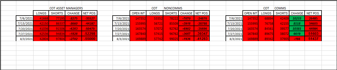
USD.


Looks like the trend is continuing. Although the Asset Managers have been more bearish than the Non Comms.

Here’s the trend.


The uptrend is still intact.
This week they were riding on a support level. Couldn’t fall below it. NFP boosted it.

EUR.


Well, I just see the EUR getting stronger lately. I see that in the weekly change column.


The EUR continues on their bull trend, since like most of the year now. No changes being indicated.

GBP.


Same thing. Becoming more bullish as the weeks go by.

Their bull trend has continued since the year started.
No changes are being indicated.

The CHF.


Little disagreement between the 2 speculators. It’s fair to say that the sentiment has been mixed lately.


A big fall this past week. But I consider the Swiss still on a bull trend.

JPY.


Same story here with the other safe haven. It’s been back and forth. Mixed lately.


The trend is definitely slipping back into doing what they do best.
Move lower.

AUD.


The bearish theme continues with the speculators.


The big picture tells it. If your a trader, you would want to be short than long. I’m just saying…the trend is continuing.
Oh, and no indication of a change to that either.

NZD.


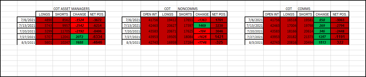
This weeks been bearish from the Non Comms, but a bit more bullish from the A.M.'s. But to look at the Commercials, they seem to be getting more bullish, which in my mind should be the complete opposite of the speculators. So maybe they are becoming more bearish for us speculators (like the AUD).


Big jump this week. No doubt. But I’m not calling it enough to change their trend. We got to see what happens next week.
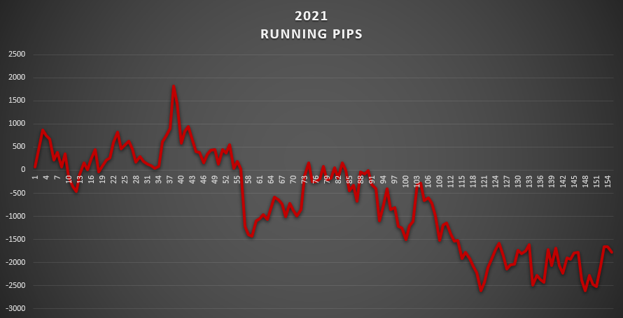
CAD.


More bullish coming from the speculators, and more bearish coming from the commercials lately.


But in this context, you have to see that their trend is broadly for down. They surely fell from grace lately. It’s like their starting the year all over again from 0 now.

And that’s all of them.
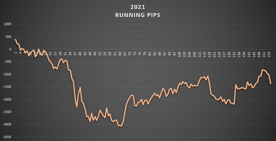
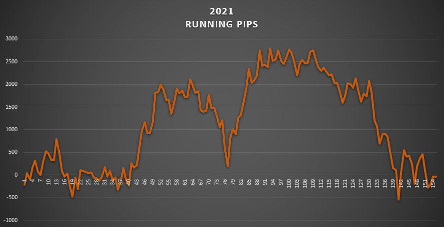
You do not need to be a genius to see which currencies have been the easiest to trade this year. I would say this would be that order.

  • The EUR
  • The GBP
  • The JPY
  • The USD
  • The AUD

And these trends will continue.
Until they change.
When they do, I’ll give you heads up.

Mike

Quick question guys: I cannot figure out the symbol for Gold on the Barchart website. I tried to use “GCY00” but that is not good. I would like to see the COT report there for Gold. Any idea?

I believe it is just GC https://www.barchart.com/futures/commitment-of-traders

You can flip between “Detailed” and “Summary” reports on the drop down list here: https://www.barchart.com/futures/cot-reports/metals?view=noncommercial&report=summary

Hope that helps.

Hey…

Well, I think I uncovered something interesting.
Let’s talk correlations.
Specifically, what the COT report shows, does signal when a big move is coming.
I was a bit late when this occurred, cause I just jumped on board a few weeks ago. But now that I’m paying attention closely, I hope to see something like this again.

I’m talking about extremes. Well, we had one recently.

And remember my notion that we will only see an extreme after the fact?
Well, I just might want to check that.

This is what I’m talking about.

The CAD.


I put that up there to show you the extreme numbers. Circled in yellow.

But, the premise here is that the CAD was very strong heading into June. A top formed. And this is evident by those circles.

  • On June 1st, in the Asset Managers report, the longs peaked.
  • On June 1st, in the Non Comms report, the longs peaked also.

----- That’s hint # 1.

  • On June 15th, in the Asset Managers report, the shorts were at that extreme.
  • On June 15th, in the Commercials report, both longs and shorts hit extreme.
  • On June 15th, the total open interest peaked.

---- That’s hint # 2.

  • On June 29th, the Non Comms report showed their shorts at an extreme.

— That’s hint # 3.

If you’re not a numbers person, then how did the charts show it?
I’ll show these in the order I just told it to you.

The point here is that we had all kind of indications all around us.
Just paying attention to these numbers would have given ample time to jump on a short CAD trade.

Now keep all that in mind, and let’s go to some price action.
What’s been happening ever since June 1st, with the CAD?
Take a look.


I got the dates incorporated on that. This way we should be able to see what’s been indicated with the COT report, and at the same time what’s been going on with the CAD aggregate running pip count.

Look up there at the beginning of June. It is slipping. Someone could be calling a top regarding the CAD, in the month of June. But, would they have been too late?

Absolutely not!

Their fall has just begun. In fact, it wasn’t until July that the floodgates burst open. Down they go. Just pick a CAD pair, doesn’t matter which one. I’m sure it was eating dust by this time.

Well, they took a bounce by now (in Aug).
But all I’m saying is that the alarm should have been sounded in the month of June.
We could have had this on the radar and seen the fall out in the whole entire month of July.

I got to run.
But, I hope you see the point here.

I’ll be on the look out for any other opportunities.

Mike