Hello.
Let’s take a look at the latest COT report.
FE, I’ve definitely taken into consideration all of what you said. All week. And so, this is what I got so far. It’s gonna be a rough layout, but until I get something standard going, this is gonna have to be what my analysis looks like.
This is going to be the data that I am collecting.
— The 8 currencies found in these reports :
- The Non Commercials - Legacy report
- The Commercials - Legacy report
- The Asset Managers - Traders in Financial Futures report
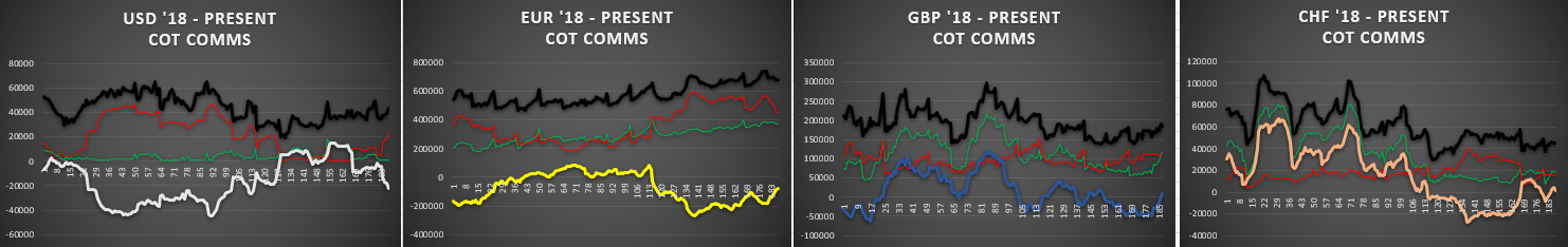
So. Looks like 3 years it is. And I guess that’s a good place to start with. Big picture view. And then I’ll bring it in closer as I make my way through it all.
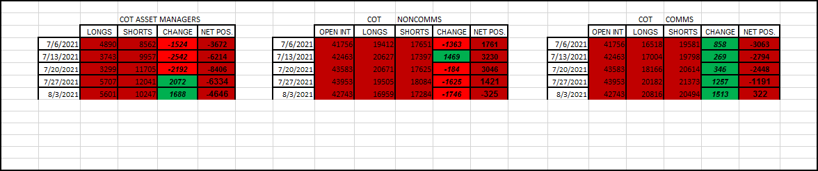
3 lines. Green = longs. Red = shorts. Solid = the net positioning. Black = total open interest (applies to the noncomms and comms only, which are equal)
4 currencies here. The purpose of this view is just to be able to see if there are any extremes. Extremes from the last 3 1/2 years. And the only extreme I see here is coming from the EUR, from the open interest amount. Let’s take a closer look at that.
More specifically, we are coming off of the open interest extreme.
What can we say about this?
Well, the open interest has been high in this last year (comparatively speaking).
Lately, the shorts have been increasing, in which has been causing the net positioning to drop more negative. See the trend lately?
I guess we need to further investigate this. The EUR.
What has been going on with them.
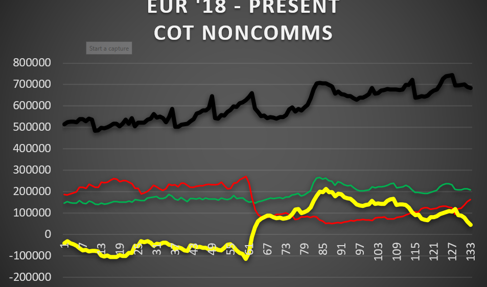
Here’s a close-up of the 3 reports.
The trend has been continuing downward, albeit, at a much slower pace than the last 2 and 3 weeks ago. But, in the first 2 groups there (speculators) the shorts are increasing and the longs have been decreasing. You have to see that. That is the cause of why the net positioning is ending up moving negative.
Mind you, all I’m doing here is looking at what’s been trending. For the moment, that’s it. That’s been the sentiment. I quite don’t understand that, but that’s how the numbers are turning out. I kind of thought the EUR has been more bullish of a currency than bearish. And why?
Now, let’s turn to some price action (cough FE cough).
This is aggregate price action. It’s what’s been happening in the market. I believe this is the best way to compare how the EUR has been moving alongside what the report comes out with.
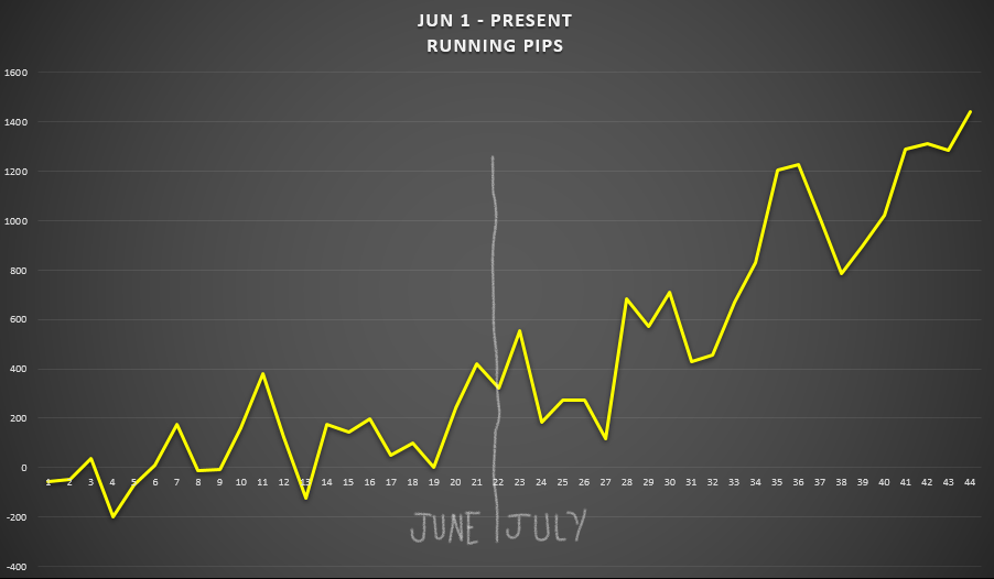
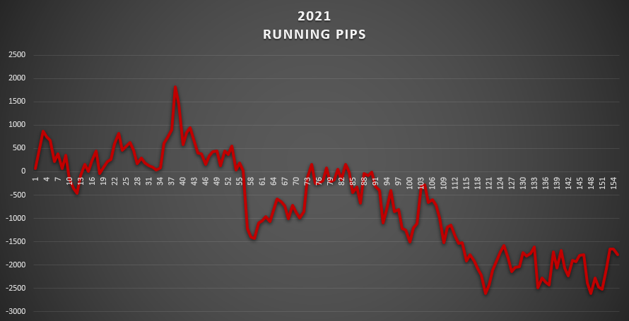
Looks like I’m going with the context of June 1st, up to the present (above table).
Ok. That’s the EUR aggregate running pips from Jun 1st. That is how the EUR has been moving, on a daily basis, since then. Aggregate means if you add up all the pips from the 7 EUR pairs. It’s the net amount. And if you ask me, moreso for July, the EUR has been trending bullish.
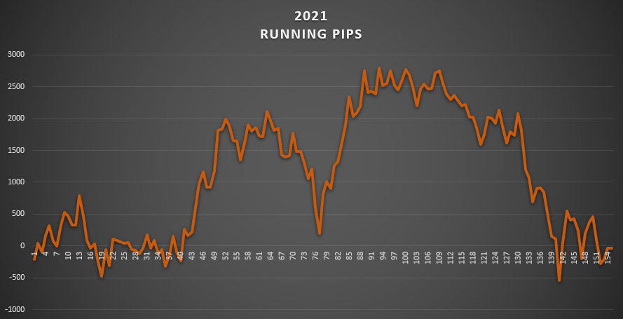
How about this for a comparison. This is the best I can do.

The dates are completely matched up. For the running pip count I stopped at EOD the 27th. Which was last Tues. I should have put Jul 27 there. Just know that it is.
This is unmistakable.
The shorts (red line) has been increasing more most of these 2 months.
The longs (green line) hasn’t been moving much.
The net positioning is resulting in an increase of short open interest contracts, this whole time.
Well, I can’t explain that. The correlation doesn’t seem to make sense.
How can the EUR’s movement be more bullish, meaning being more bought up, when the open interest short positioning have been increasing during this time? You would think the open interest for the longs would be the case, but it hasn’t been.
— Is the timing off?
— Are we not looking at who’s really moving the market?
— Should we assume the opposite? Like, when the shorts are increasing it means that the EUR is bullish. And when the net positioning decreases it translates into a bullish moving EUR.
I don’t know.
But, FE, you are the one who wants to compare price action to the COT report.
I’m more interested in seeing what the current sentiment is.
- What’s the trend?
- Is it continuing?
- Is it changing?
And yes, sure, we should compare that to how the currency is moving in the market.
Therefore, we should be looking and noting the 2 dynamics.
Well, we need to be looking at another currency.
How about the GBP.
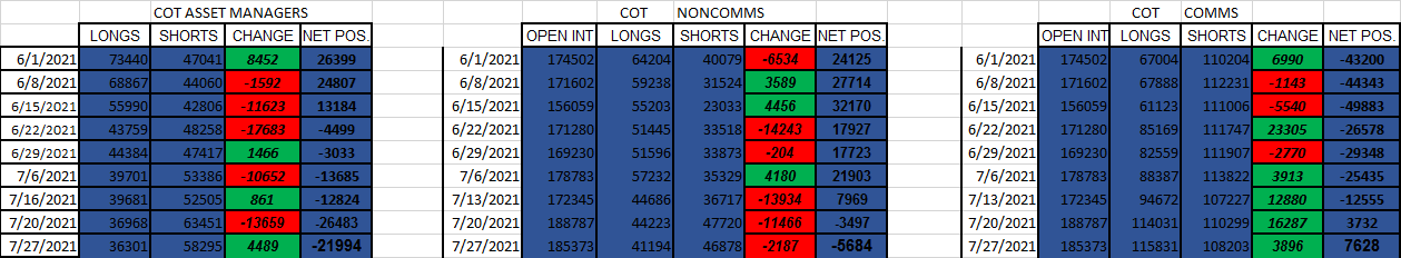
We got the latest figures at the bottom. This is how I view it.
— COT asset managers — Net positioning went more positive than last week (green). But the positioning is negative (means it’s bearish, because the shorts outnumber the longs… by 21,994 contracts).
— COT noncomms — Net positioning went more negative than last week (red). This is a differing view than the A.M.'s above. But, the positioning is negative (-5684). That matches the other. Actually, this is the first week that the positioning has entered into negative territory. The A.M. has been in negative for awhile now.
— COT comms — I guess this is where we can talk about the total open interest. That has decreased since last week. Interesting. Signify anything? Well, only that there’s been less activity happening with them than last week. And concerning the net positioning, the commercials are continuing their trend of having more open long positions than short positions. That’s nice, whatever that means, cause I really don’t know, other than the fact that they seem to be on the opposite side of the speculators.
That is the table, up there, but going back the entire distance. No extremes.
I guess all that’s left is to do the comparison.

Again, it’s the 27th of Jul that both of those charts go to. Last Tues.
And just like the EUR, we have a bullish moving aggregate GBP pip movement going on in the market. And when it does retrace for a couple days it’s not by all that much. But, what’s the net positioning telling us? Bearish. The shorts have been on the increase lately. And the longs have been decreasing. This just does not point to being bullish. I don’t understand how these 2 charts can be telling 2 different stories.
We’ll need to keep monitoring this, cause if we’re dealing with a very lagging COT report indicator, I just want to know, that’s all.
I just need to ask the question again.
Why are we looking at this market sentiment data again, when we seem to get a more accurate sentiment just by looking at the aggregate pip movement results?
Maybe over time one of those indicators can reinforce the other one. Hopefully some kind of pattern can emerge.
Well, personally, I want to be able to monitor what the trends are. In this case, what the trends of what the asset managers are doing, the non comms are doing, and what the commercials are doing. I believe there is the predictive power of knowing what the correct trend is. On the one hand, it can tell you when you should stay put (when the trend is continuing) and on the other hand, it can tell you when the trend is changing (get out). All that knowledge, inadvertently, has to do with my trading. Especially if I start encountering changes in the market. Hopefully this can be a help, as in a confirmation tool.
Let’s move onto another currency. Keeping with the majors still.
How about the USD.
— The COT asset managers have increased their net positioning, compared to last week (green). By a lot. The most in the last 5 weeks. The longs have increased very much. The shorts have decreased. All that is very bullish. If you ask me.
— The COT non commercials have followed suit. We have the same thing, in which the open interest long contracts have increased since last week, and the open interest short contracts have decreased since last week. This positive net positioning has been trending this way for 4 weeks in a row now (right column +). Again, this is very bullish. This trend is continuing.
— The COT commercials are showing their continuing trend of bearishness. The shorts have increased, but also the longs. Interesting. But regarding the total open interest, that has increased by a lot. So we can say that the activity that’s going on with the Commercials and the Non Commercials are increasing.
You can see there of the black line that it’s nowhere near the extremes. Other than the fact that it is moving higher.
Let’s do some comparing.

Price action in the last 5 days (that leads up to July 27th), have been moving lower.
But the COT report shows nothing but bullishness, up and including the 27th.
This can go one of two ways.
-
Is the daily price action showing a change? Will we see this in future COT data report numbers? Time will tell, and we would want to see these patterns.
-
Is the bullishness of the COT report more relevant and will it support future directional movements from the USD?
See, these are the questions I want answered. We just need more time to play out and find out these patterns.
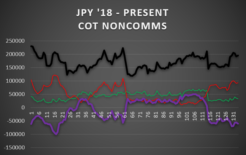
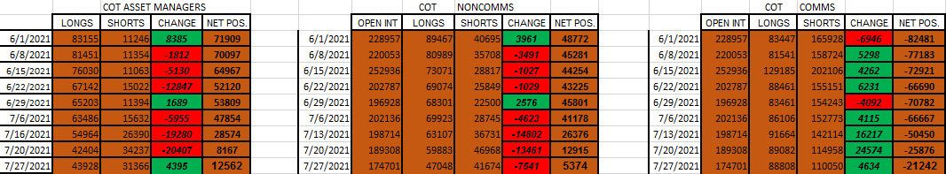
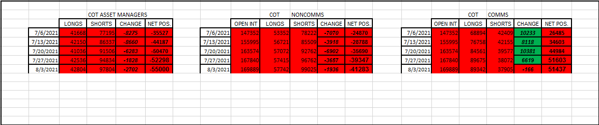
How about the JPY.
— The COT Asset Managers — Showing a markedly bearish change since last week. Seems like back to the old story. Shorting being the favorite. But the shorts have increased a whole lot, and the longs have decreased by a good bit. Both of those things definitely points to bearish.
— The COT NonComms — Showing very similar. It went back to the short play. The shorts increased and the longs decreased. Very bearish.
— The COT Comms — Switched from what they were doing in the last couple weeks.
So, what I see is a change in these numbers. It’s not the trend of getting stronger. That’s all.
Any extremes here?
Not really. Although the open interest short contracts (red line) is flirting close to the extreme area. And the total open interest (black line) is in the vicinity for that extreme also. So, I guess there are things here to be paying attention to.
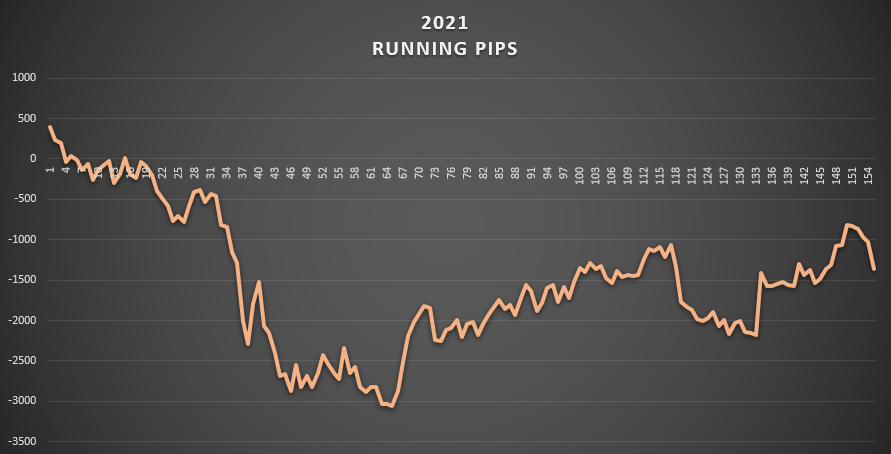
Comparison to market movement action.

At the top, the market movement, you can see that there have been spikes moving higher. No doubt. But it doesn’t take long for them to get retraced back on down to 0. And that’s a hard case for it to be considered a trend. It’s not making higher highs. It’s not even making lower lows. It’s just bouncing up from the floor, like a rubber ball. It’s sideways action.
The bottom, shows gradual and smooth movements. The shorts are quite high. The longs are low, relatively speaking. And the net positioning results show that it cannot come up off of the floor.
All I know is that the JPY is not continuing on with that bear trend that has been in place since the beginning of the year. It’s very much sideways for awhile now. We should be awaiting a break out one way or the other. And we’re not seeing it yet on these charts. Need more time.
The AUD.
— The COT Asset Managers — Showing a continuing bearish story, although at a much slower pace. The shorts have increased but the longs have increased also. Making the point of a slower moving bearish sentiment. Just look at the last weeks CHANGE numbers. Those are high. Well, we either are taking a breather here, or we’re about to see a trend change soon. Like turn bullish.
— The COT NonComms — Showing the same thing. A slower pace of bearishness. The longs have increased but the shorts have increased way much more.
— The COT Comms — Seems to be continuing on with the same trend. It’s very bullish, which is the opposite of the NonComms.
— The total open interest (black) is starting to climb into some high territory. We’re not talking extremes yet, but I do have to say that it’s been awhile since it’s been this high.
— The open short contracts (red line) is definitely getting close to the extreme. Just above that gridline is extreme.
Comparison.

The top table is the running aggregate pip count since June 1st. Very bearish. There’s only one V shape move, at day 15 - 19, that shows some kind of retracement moving more than one day in a row. Every single V shape than that, is for only one day. That’s a lot of bearish days for the AUD.
Bottom, shows all the bearishness coming from the bears. Not from a lack of bulls. I would hate to see if the open interest bull contracts started to decrease. That wouldn’t be pretty at all.
The NZD.
— The COT Asset Managers — Shows the net positioning figure increasing from the previous week (-6334 is higher than -8406, therefore green). But the net positioning is negative. That means the open interest short contracts outweigh the open interest long contracts (12,041 against 5,707). That’s bearish. The shorts were increased by 336 contracts. But the longs were increased by 2,408 contracts. That’s a difference of 2,072 contracts. And that’s exactly how many it rose this week, compared to last time.
— The COT NonComms — Shows the net position decrease a lot. It goes from 3,046 last week to 1,421 this week. Quite bearish. So, we got the longs decreasing (bearish) and the shorts increasing (bearish). This shows much more bearish than the Asset Managers report shows. But the big difference between those two is that these guys are in positive territory. Meaning the longs outweigh the shorts. That is definitely not the story over there. The shorts have the upper hand.
— The COT Comms — Keeping with their respective trend. The net positioning is definitely trying to climb up and out of the negative territory. Look, right column. Go from -9k all the way up to -1k now. The NonComms go from 5k down to 1k.
I’m not seeing any real extreme areas.
Comparison.

The top table is the daily market movements.
There is a bearish bias movement going on here over the longer duration. But actually it seems like more of a carving out of a floor. Cause it’s not making any lower lows. But the upside is surely limited. And up to this point, that’s even slipping (lower swing highs).
On the lower table, you can see that the longs have the upper hand. There are, and have been, more open long contracts than there are open short contracts. And well, that’s a bullish sign. Quite smooth running lines there. All I can tell here is that it’s a slow, long drawn out bearish movement lower.
And you just wouldn’t believe it if I told you that the NZD is the highest likely currency to be raising interest rates this year. There’s absolutely no indication anywhere around here hinting about that. BTW…that’s supposed to be bullish the currency.
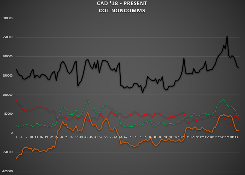
The CAD.
— The COT Asset Managers — turned quite a bit bullish from what they did last week. In fact, it’s been 8 weeks since they had this much bullishness in one week. But look closely, they can do some big moves, on a weekly basis. The longs increased, but not as much as the shorts have decreased. So it was more like the bears giving up their shorts more than the bulls taking the lead.
— The COT NonComms ---- turned more bearish. The net positioning went negative since last week. Although at a lesser pace than the last couple weeks. The open long contracts decreased by 12k and the open short contracts only decreased by 5k some. So it wasn’t because of the bears strength, it was because of the bulls weakness that made them go down. Worthy to note that these guys are more bearish the CAD than the Asset Managers.
— The COT Comms — continuing on with their bullish trend.
No real extremes. Other than the total open interest (black line) has been coming down off of the extreme. And still going.
The open long positions, likewise, have been coming down off of that extreme. And still going.
I don’t know. With this extreme positioning notion, you will only notice this after the fact. It’s only in hindsight that you can look back and see the effects of a turnaround. I mean, how many times did it hit a new high (the black line, total open interest)? I count 4 times. That’s 4 weeks that we could be saying that it’s at an extreme level. And then, when it busts, it goes down deep. Like now. Way too quick.
So. I’m not a real fan of trying to play the extreme game. Possibly matching this up with other indicators, maybe, I would consider. But, in the meantime, I’ll take note of them.
Ok. Wait. Look up above. I just remembered. On the AUD.
Remember their extreme?
I’ll post it again.
Well, not so much the open interest one, but regarding the shorts. See how close they are to the extreme? It’s the gridline just above it. So. When, if, we get that high, then we should be looking to go long the AUD. Meaning, the bears should be letting off the gas. And hopefully the bulls (green line) will start climbing.
Ok then. I’ll be looking out for that.
One more thing on the CAD.
The comparison chart.

Aggregate price action movement shows a mostly bearish daily running lower. Except for a 2 day big boost up there recently. Other than than, their a low bias. Lower lows and everything. See, now that’s what I call a trend. There’s no sideways action happening here.
Concerning positioning. The net positions make it clear every week that the bias is for low. There’s no changes happening. No faking us out. Even a little from both sides. First from the longs decreasing a lot. Then the shorts get into the game and get strong, which means bearish also.
Alright.
I don’t have the energy to do the CHF.
If someone does want it, let me know (yeah, would love to see that happen).
Oh, yeah, that’s right. I remember now.
The Swiss is getting strong. That’s right. I got to remember to switch my basket of trades concerning them. That’s the only currency I need to change.
Well, if you really want that insight, just visit my journal tomorrow early morning. I got lots to talk about there.
Anyway.
If anyone wants to talk COT, or the market, I’m around.
Mike