Greetings,
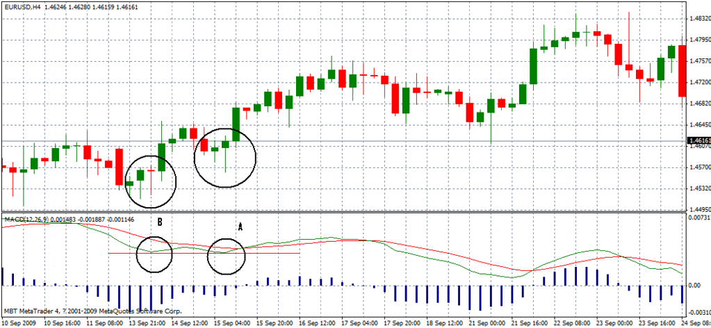
Why is the fast moving M.A circled A lower than the fast moving M.A circled B despite B having lower price than A?  I tried thinking very hard to explain this observation but still fail to conclude anything.
Hi,
It is my understanding that we are looking at 4 Hour chart of EUR/USD between 11th-15th September with standard 12,26 and 9 settings for MACD.
I actually plotted the same in my own system.
I believe the reason we have MACD below the signal is because of the way MACD is calculated.
The MACD is calculated as
MACD = Exponential MA [12] of price - Exponential MA [26] of price
In your case we are taking EMA of two days and subtracting 4.3 days EMA from it for closing prices
If you look at the periods under consideration you will see that the instrument was an in uptrend from 8th-11th and then started drifting sideways from 11th-15th Sep. The effect would be that the MACD started turning south from the 10th and crossed the signal line on the 11th. The signal line stayed above MACD as expected and only crossed below when an uptrend was firmly established after 15th.
Your circles may simply reflect the fact that MACD in a non trend move is not particularly effective as it is best to be used in a trend. Circle B being lower than Circle A I believe reflects the fact that the MACD calculation is biased more by those preceding 5 red candles than to the closing prices of three greens, one doji and two red candles. Indeed one observes the same pattern with the signal line.
HTH,
Mich
Chart printing.pdf (16.1 KB)
I used to use MACD(12,26,9) And I agree with mich, it is in the way the formula works. However, when using this indicator, I ALWAYS paid a lot of attention to the histogram. In your example chart, it is diverging and for me that is a signal that there MAY be an upward move in price.