Trendlines Demystified

This is going to be a short presentation on my use of trendlines.

I will be using 30 minute charts from my own trading platform, showing how I use trendlines to trade the past weeks EUR/USD price movements. I will be using these charts to walk you through a week of trendline trading so you can see how to make the most of trendlines.

There are two main reasons why I chose to use these charts.

First and foremost because I spent most of last week trading the EUR/USD so it is easy for me to remember what I did and why, secondly I don’t want to make a tutorial based on theoretical after the fact old charts that I didnt trade on.
By using my current charts from the past week you will be able to see this tutorial is based on a real live trading scenario.

I will only be looking at downward trends for now because even though I could show both up and down trendlines it would make the charts very cluttered with lines and harder for you to read and for me to describe, but it is worth remebering, everything I talk about these downward trends applies in reverse to upward ones.

I’m going to attempt to put this whole presentation on as few posts as possible so I will put as much on each post as is allowed, this forum limits posts to 4 images each so there should only be 4 posts, I want to try and keep it short and sweet so you can scroll through it easily instead of having to trawl through a ton of posts with interruptions etc, so if anyone has any comments they will be after the end rather than in the middle of it.

Before I start I want to answer two questions.
What is a trend ? and what does a trendline signify ?
These are important concepts to understand and will be neccesary in understanding why we do what we do while trading with trendlines.

A trend is the result of a large amount of people doing the same thing, as in a fashion trend, the reason it becomes a trend is because a lot of people do the same as everyone else.
This is a fundimental concept in forex trendline trading and the power of the trend should not be underestimated.

In forex trading the trendline helps us not only see that trend, it also helps us predict what that trend will do in the future.

In order to make the most of trendline trading the first thing you need to do is get in the mindset of a trendline trader, I’ll explain a little more about this as we go along but for now, what this means is you have to be aware you are trying to become a part of the trend, you need to be a follower of fashion, if you can do this you can get with the trend and make money from it.

In this presentation I will be using a couple of forex related terms that most of you will already know but just for anyone that doesnt, lets define support and resistance.
Support is a level at which the price stops falling and is usually the point at which a price reversal is seen, resistance is a level at which the price stops rising, also a point at which price reversal is usually seen.
Both support and resistance levels are temporary and can be breached later but this is what we want to happen, you will see why later on that too.

OK lets get started.
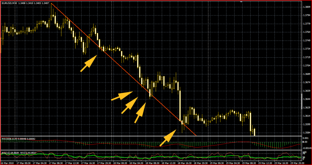
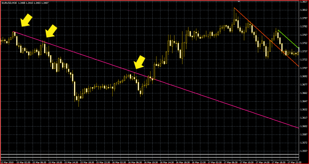
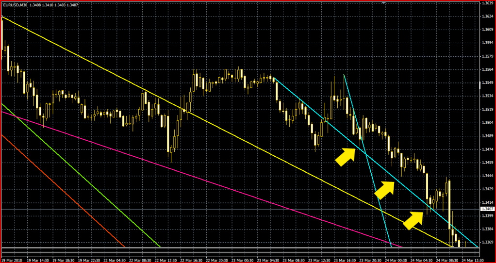
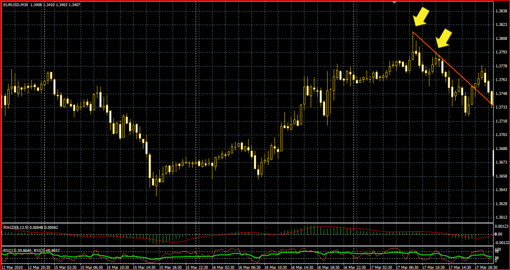
First of all lets take a look at our first chart, from 17th Feb.

As you can see towards the right hand side of the chart, there is a price rise which ended with a nice spike candle at the top, then a price fall began which I have marked by three yellow arrows, what we are going to do is mark out the beginning of that price fall with a red trendline, the way to do this is pull the line between the FIRST TWO obvious highs, so when you pull your trendline you want to see a high followed by a fall followed by another high.
Join these first two highs with the trendline and let it ride !!

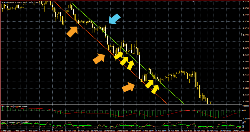
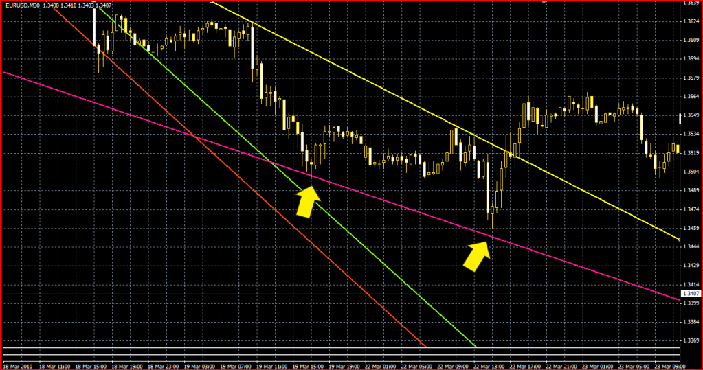
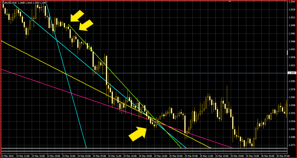
Now this next chart shows the red trendline.

As you can see it was a short lived little trend, the trendline was broken shortly after I drew it when the price rose through it, so what do we do now ?
We leave that red trendline in place and we draw another trendline as soon as there are two new highs after the trendline break.
The reason we do this is simple, we are simulating live trading, if you are live trading you can’t see the whole trend revealed like you can in analyctic charts.
In live trading you only see the beginings of the trend so you have to mark it out with a trendline as soon as you can. Why ? You may ask.
Because millions of other traders are doing this, so we want to do what they do so we can see what they see and make our decisions on the same information they do.
If we wait untill a trend is established for sometime and pull trendlines across the average highs, our trendline wont match the trendlines of the live traders who are pulling theres as the action happens, and therefore our decisions on when to buy and when to sell will be out of sync with the rest of the trading world. We obviously don’t want that so we pull ours across the first two obvious highs that show themselves.

This next chart shows how we draw the second trendline.

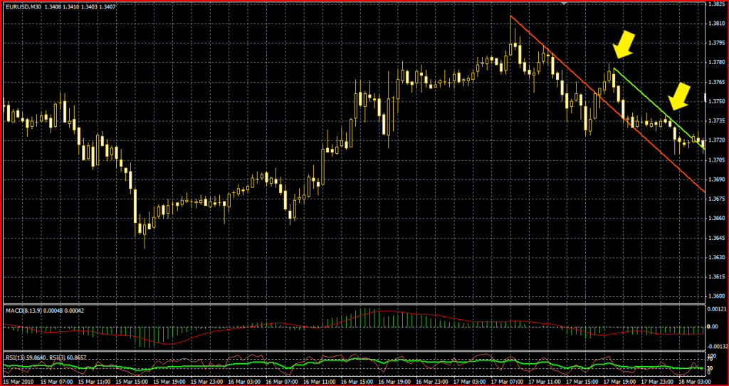
As you can see after the red line trend break I have drawn the second trendline this time a green one between the first two highs after the red trend line was broken.

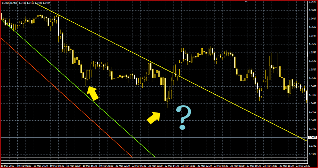
Now lets have a look what happend after that.

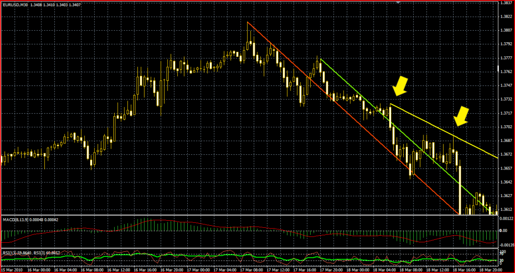
You can see the trendline was broken again I marked this by the first yellow arrow.
This trendline break was a small one, barely enough to be considered a break but there is one bull candle cleanly above the trendline, but only just, this is very important to note, it was only barely a trendline break, but we are still going to pull another trendline.
You can see I drew a yellow one from the high at the trendline break to the top of the next high that occured, where the second yellow arrow is.
We now have three trendlines drawn, lets have a look where they take us.

What I’m going to do here is discuss each of the three trendlines one at a time so you see the only trendline visible on this next chart is the first one we drew, the red one

Have a good look at this chart, this shows a very important concept in trendline trading, support and resistance levels in a different way to the more commonly discussed fibonacci or pivot point theory, which use horizontal lines but is equally if not more important to understand.
Lets go over what we did, we pulled the trendline across the two highs then we saw the trendline broken by the price rising above it, the price then falls but look where it falls to, it falls onto our trendline which prior to the trendbreak, marked out the highs (the resistance levels)
It has now reversed its role and is acting as a support line, the price lows fall down to it then rebound back up then falls back to it then rebounds back up three times in all.

Now lets look at the second trendline we pulled, the green one.

What is happening here is what I like to call a trendline battle, we have two levels of resistance close together and two groups of traders, the first group are trying to sell down to the redline
The second group are more hesitant and are stopping their sells at the greenline you can see how after the small trendline break at the blue arrow, the price fell down to the redline then rose back above the green line, after the sellers stopped their sells at the green line and let the buyers hold the price above it but there were still some who thought the red line was the main support line and eventually they got their way and the price fell down to it in a big downwards candle before bouncing back up and sitting above the green line for a few hours, then taking off in another rise.

Alright lets move forward in time and see what the yellow line is going to do for us.

Now you can see how The new yellow trendline is holding firm untill Monday afternoon, remember we pulled this line between two highs on Thursday, it was good resistance on Thursday, Friday and Monday untill finaly the buyers broke through and the trendline is breached. you can also see how the price almost touched down onto the green line before rebounding back up

Now lets move forward just a little…

Even though our trendlines have been accuratly predicting the price levels since we pulled them, there is something amiss here do you see what it is?

This next chart outlines the problem.

You might say ahha Mr SDC your pretty colored lines dont exactly explain why the price did the wild thing in the middle of them and reversed back up for no apparent reason and you would be right, but lets see if we can figure out why this happened, as all good tutorials say, when you want to find out what is happening now and why, look left. This means look back in time by scrolling over the chart going left.

So in this next chart we are now looking back at the day when we pulled our first red trendline.

You can see our first trendlines at the top right hand side of this chart you can also see I’m pulling another trendline over the highs from a previous price movent, a pink one this time, one we didnt bother with on that first day, but now we need to you will see why we should have done this on the next chart.

Now we’ll move forward again back to where we were, you can see why we should have pulled that pink trendline on the first day.

This new pink trendline explains two things, first why the price didnt touch down onto the green line, the reason it didnt is because so many traders would have pulled that pink trendline days before.
Then several days later this happens:
The price is dropping by the left hand yellow arrow but look, the old pink trendline is in the way of the expected green line support what shall we do ?
We try to do what we imagine the majority of traders would do.
We err on the side of caution and say, well the difference between the green line and the pink line is only a few pips so lets use the higher pink line to close out our sell orders just in case everyone else does that and the price doesn’t reach the green line.
This is why I say you have to get with the trend and do what you think the majority would most likely do, so always pull your trendlines across the first two highs as the live traders would have done when those highs were just emerging, and remember the majority are usually not gung ho traders who want to risk all on the throw of a dice.
They want to make as few losses as possible and will usually do the cautious thing, this is why, even though the pink line is old and for several days had nothing to do with the price action, once it appeared above the current support line it was the wise choice to use as a new support line.
You can see the pink line remained in force as the primary support level after that too as shown by the second arrow.

OK lets continue moving forward we can see the red and green trendlines are now out of the action and the yellow trendline was breached so we need another new trendline, this time I’ll make it blue.
I do as before and pull it from the first obvious high after the trendline break to the second high, the arrows show these points. You might say but hold on a minute they arnt the first highs, the reason I took those is because we are looking at downtrends, the actual first two highs would give us an erroneous uptrend, you dont pull uptrend lines across the highs you pull them across the lows so those first two highs cant be used.

Now we have our new blue trendline we’ll move forward some more and see what pans out.

As you can see the blue trendline was shortlived and breached then did what we have become used to seeing, after the price rose above it, it became the primary support line.
I have also pulled a second blue line just to show you another concept in trendline trading, this isn’t the best example because it is ver short lived, but I noticed it while pulling the main trendline so I thought I’d show you the triangle theory, when you have two trendlines converging it creates a triangle.
On our chart here you can see it with the point at the first yellow arrow, when the price action is inside this triangle, expect it to bounce out and off the support line when it reaches the apex of the triangle.

Alright lets continue on “I have such sights to show you” hehe, we’ll move forward in time a little more and see what happens.

You can see I pulled a new green trendline after the blue one was breached, the price continued to use the blue line as support for some time then eventually fell back to the pink one, but check out the deal here !! All our trendlines are converging what does this mean ??
What this meant to me at the time was that was going to be the last time I put in a sell order !!
I wasn’t sure exactly what would happen if and when the price reached that point but it is the triangle theory I touched on earlier so I had a good idea it was going to be fairly decisive, as you can see, the price bounced off that point and went a little higher than all the other previous little rebounds, it then fell back, but then another much bigger rebound off our supporting trendlines then another fall back onto them folllowed by …

…Followed by a big price rise, so my initial thoughts about all the trendlines comming together at that point turned out to be good enough, a big rise did happen, it just took a little longer to happen than I had thought it would. Also note our pink trendline, the oldest trendline we used, ended up as the last downtrend support line before the Friday close.

Well that is our last chart as you can see it ends with Fridays close.
I hope you enjoyed my little tour through the week of trendlines and I hope you got something out of it to help you with your trading.
I would have liked to continue on by plotting pivot points to show you what happens when they intersect with the trendlines but at the last minute I realised I dont have the past weeks daily pivot points and the thought of working them all out from the candle charts isnt very appealing.
That doesnt mean I won’t do it, it just means I’m not doing it right now because theres a 6 pack in the fridge and I’ve been at this long enough already lol.

SDC:

This is a beautiful learning curve for trendline/ support/ resistance fans. You took a lot of pain, time and great effort in making these charts. I thank you so much and I will look forward to see more of your interesting posts moving forward.

Regards,
Muthu.
Chennai.
India.

Great info SDC. :slight_smile:

Have to give credit where credit is due - I am grateful to you for loading another potentially lethal weapon into my trader’s arsenal.

Regards,
xXTrizzleXx

Hi SDC,

Thank you for this thread. It’s terrific and I followed it mostly with a clear understanding. I know from reading other posts & threads that drawing trendlines can be somewhat subjective but it seems that there are [B]some[/B] concrete rules such as the one in your chart drawing the 1st green line. This is where I have not quite got a grasp yet. In that chart you say you are drawing a line connecting the next 2 highest highs after the break of the support line. I don’t quite get how you chose the 2nd point. The first one is pretty clear except it seems like you started it on a bull candle. The 2nd one I can’t see how that is a “highest high”. Seems like several candles before it in the ranging area reached the same level.

I seem to have remembered seeing you on Tyman1’s thread about trend trading. For me it has been a great learning expeirence. Thanks for any thoughts.:slight_smile:

The way I choose the highest high is I wait untill the price falls enough after rising to make it an obvious high point, or in the case of the green line you can see although the candles are the same highs before the next fall, only one of them (the last one) would allow the 2nd point of the trendline to cut cleanly above the rest, any of the others would make the trendline cut through the one after it. You are right about it being somewhat subjective which is why I stressed the idea of becoming a part of the trend.
There are times when the high isnt a bull candle, and some when it is, so what are the majority of traders going to do ?
I say they will just say well hell lets just use the highest one and go with that, this is the main reason I do that, not because it fits into a predifined set of rules, but because I want to do what I believe the majority of traders would do.
So I look at the chart and try to see what is the most obvious points to pull the trendlines because what is most obvious to me, will probably be most obvious to everyone else, the idea being if I use the same points as the majority, I will have trendlines the same as the majority and therefore put my orders in when everyone else does, if the majority puts sell orders in at the same time they cause the price to fall so they all profit, when everyone sees the same support level they all close out there sells and put in buy orders to cause a price rise.
This is what we want to do too at the same time as them.
Its known as a self fullfilling prophecy, this also applies to fib lines and pivot points, so many people base their trading on them that they become self fullfilling prophecies too.
What we really need to do, and what I originaly intended to do is plot pivot points on the same charts as the trendlines to show how they reinforce each other and their intersections can point out future entry and exit points unfortunately I didnt keep a list of the last 7 days pivots if anyone has them noted dwn from last week please let me have them and ill use them to illustrate this theory too.
It might be worthwhile doing the same with fib lines too, I’m not as keen on fib lines as I am on pivot points for day trading though.

…awesome.

Thank you SDC for that explanation. Very helpful. In reading and studying the past few months it seems that there have been several refrences to the “big boys” hedge managers, banks, brokers etc. One of the reasons I became interested in this was because of the heavy influence the “big boys” have in the stock market and their ability to make a stock go where it really should not based on it’s fundamentals. I was under the impression that FOREX was relatively immune from this due to it’s large volume as compared to NASDQ, DOW etc. Whats your thoughts on this. Are we safe from any big players making a pair go haywire over the long term?

As far as I know the only ones that have the financial weight needed to manipulate the forex market are the central banks a few months ago the Swiss National Bank was intervening by dumping currency to prevent the CHF from appreciating further than they wanted it to against the USD

Thank you, SDC, for your most wonderful and thorough explanation of trendlines! I have begun to draw my first trendline on the 30-min. EUR/USD starting w/my first high at 2:30 AM and my 2nd LH at 8:30 AM and we’ll see how it all works out. If you can explain pivot points as well as you just explained trendlines, I would be so appreciative and happy! :slight_smile: Thanks again for taking the time out to share that!

i got clear idea about trendlines thank you
excellent work
can u explain about horizontal sr lines