Looks like 1-30 is trying it’s hardest to hold as support just now from what I can make out on my phone
Well I’m fairly astonished at how this panned out, the SL and TP were at the red dashed lines, unfortunately as my account funding is so low, I had to go 2% risk. It all came good, although I did think when I got home this evening that my TP was a little ambitious, so took my profits at 2:1.
All in all a good day.
A long road ahead though!
GG
I think, and I know I have been guilty in the past of breaking this rule myself, that regardless of the size of your account GG, 2% should be your maximum risk anyway. Doesn’t matter if you have a $50 account or a 50k account, it’s still 2%. Or if I have picked that up wrong and you meant you don’t usually like using as much as 2%, I think it is still acceptable. Sometimes we need to be outside of our comfort zone a little, if only to remind us where our comfort zone is.
Below is an extract from a book that I DID download. It was written by the same Kathy Lien who wrote the CoT Report article I posted not long ago. Your 2:1 win was more than respectable GG. But in reality, it doesn’t even have to be 2:1 if you ask me. A win is a win, a profit is a profit.
[B][U][I]1. Never Let a Winner Turn Into a Loser[/U][/B]
Repeat after us: Protect your profits. Protect your profits. Protect your profits.
There is nothing worse than watching your trade be up 30 points one minute, only to see it completely reverse a short while later and take out your stop 40 points lower. If you haven’t already experienced this feeling firsthand, consider yourself lucky - it’s a woe most traders face more often than you can imagine and is a perfect example of poor money management. The FX markets can move fast, with gains turning into losses in a matter of minutes therefore making it critical to properly manage your capital.
One of our cardinal rules of trading is to protect your profits - even if it means banking only 15 pips at a time.
To some, 15 pips may seem like chump change; but if you take 10 trades, 15 pips at a time, that adds up to a respectable 150 points of profits. Sure, this approach may seem as if we are trading like penny-pinching grandmothers, but the main point of trading is to minimize your losses and, along with that, to make money as often as possible. The bottom line is that this is your money. Even if it is money that you are willing to lose, commonly referred to as risk capital, you need to look at it as “you versus the market”.
Like a soldier on the battlefield, you need to protect yourself first and foremost.
[/I]
Some people may not agree with the above. But at the end of the day, they look after THEIR accounts, and YOU look after yours.
Well done for today, I hope there are many more like it.
HoG
Price has been reacting very good at support/resistance levels, the 1H up trend channel is still valid.
This may seem like a strange question yunny but I thought I’d ask it anyway. In the above charts you posted the other day, you have some supply and demand areas marked in green and red ( or a lovely shade of pink !!).
I was wondering how you dtermine the SIZE of each area. I noticed that each area is taken from the high / low of the wick of each candle. But how do you determine how “thick” each area will be, if you see what I mean.
Those areas are painted by a MT4 indicator based on Sam Seiden’s S/D. But you can do it easily by yourself
First a consolidation area, then a break level and a long candle that shows price moved away fast from the consolidation area.
The size or thickness is determined by the high/low of the candle (as you said) and the open/close of the previous candle before price moved away fast from the consolidation area… that is known by me  as “break level” others like Sam Seiden call it “imbalance”
In the image you see a dark green supply area, is “dark green” because it has not been tested yet.
The “light green” supply areas has been tested at least one time but still valid
The same goes for the demand areas but they are colored in red.
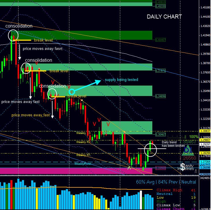
Hope this helps
Yunny I did not see any red. All I seen was a really pretty shade of pink (as HOG pointed out) lol. IF you dont mind me asking what are the 3 lines. Are they the same moving average just plooted on the high, low, and close. What do you use them for. They are very eye catching when I see your charts
Sorry, no you can not see the red in that chart. The pink area is demand zone that is been tested, when is red is a “untested” demand area…
Those 3 lines are Keltner Channels, I used them to assess volatility, in my daily chart the parameters are 21 DMA, 42 period ATR, and the channels are 2, 3, 4 ATR factor respectively
Thanks I have never seen keltner channels. I was wandering how you got them above and below price like that.
I was just messing with you on the red areas lol.
I take a peek here every once in a while, definitely never posted before. But this is CRITICAL in my opinion. If your in the green at the very least reduce your risk, but most of all who doesn’t like being in a position where you cant lose? I sure love that feeling, knowing that i can go play xbox or something and no matter what happens my account is larger than when i started. LOL what a feeling!!
Was trying to upload a chart to illustrate what this post was about, but for some reason tinypics is taking an age to upload the image so I’ll try through babypips.
All I had anyway was a 4 hour chart with three orange lines representing support lines I’m looking at that I would like to see taken out before I begin to think we might be heading lower.
First one was a break of the uptrend support line, (which has just been broken but obviously price has not yet closed below the line on the 4 hour)
Second level is the Daily S1 which is coming in around 1-2975 (which price has just bounced back up from)
And the third level would be yesterday’s low which I believe was around 1-2955.
Just tried to upload image and it didn’t work so I don’t know what’s going on with that, but if I wor it out I’ll add the image.
But that’s the levels I’m looking at anyway.
This is the image I was talking about. Hope it comes out clear enough.
Up channel has been broken to the downside. Obviously only time will tell if it was a false break below or if it is just part of the bobbing up and down stuff before the Fed today.

Now looking at 1-2910 (daily S2) then down to 1-2850 if down move continues
Took a loss on that break to the downside there this morning. Thought the support around 1.2880 would hold up. Bad Davos news put an end to that hope. Another messy day - think I might leave trading for this week unless something clear shows up. Or check out another pair though I tend to stick to E/U mostly. Did ok Monday to Wednesday so maybe standing aside might be the wiser choice.
Glad is was stuck in the bowels of HMS Illustrious today instead of being anywhere that I could have been tempted to take a trade.
One to sit on the sidelines I fear. In fact I’m tempted to switch my attention to an alternative pair.
Looking at the daily EU though. A fib drawn from the high of 27 Oct 11 down to low of 16 Jan 12 shows a 38.2 retracement level at 1.3240, which was a level of support back on 25 Nov 11.
Do you folks we could now see the price bounce off this as resistance level if the price begins to rise?
GG
Next resistance is 1.3196/1.3236 area
I agree yunny. I have a 38.2% fib running at .3245 ish. Fro there I think it would be re-assess. But I think time to go short again, would probably be around .3350. assuming , that is, things have not changed and short is still the long term view.
Personally I’m out of EUR/USD until the picture clears up a little. The fundamentals are still net short, imho, but the technicals are mixed. I don’t trade a Pair without a clear Daily chart, so am just staying out of EUR/USD for now.
Have been keeping myself busy banking pips on NZD/USD, USD/CAD and AUD/USD - much nicer charts at the moment, imho.
Afternoon all, by the way, sorry not to have been around much recently.
ST
Did take a long EU this morning from .3115 after Uncle Ben opened his mouth yesterday and blew me out of a promising short. Am just waiting just now to see if New York open takes us up to 1.32 before I close out. Stop already at BE so nothing to lose now.
Having said that I haven’t been doing much in the way of active trading last week or so. Too many distarctions going on for clear decisions.
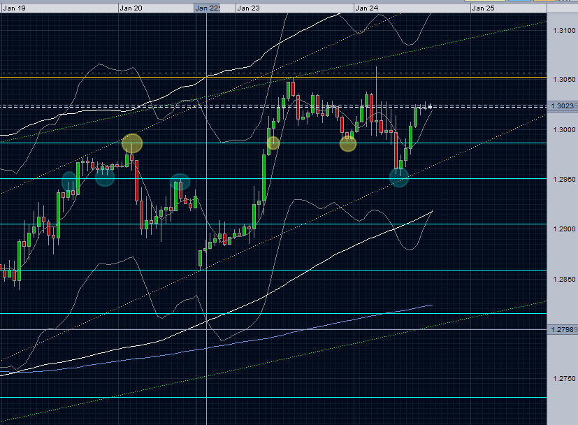
I know it may be a little early in the day to ask this question, but are we seeing signs of the market beginning to get tired??
1 HOUR

4 HOUR

I thought yesterday that we may be starting to see the begiinings of a move back down, that was until Uncle Ben did his thing. So now that the market has taken in his speech, are the last two candles on each of these charts starting to show some more signs of a tired market rally??
Or are we just having another rest before we climb further up the hill???