Thanks alot! I’ve just tried breaking down your analysis and I think I’ve grasped most of it.
This may be a stupid question but I’ll risk asking it anyway. All other factors aside, Pattern wise this analysis is confirming the price movement of C to D right?
And I’m having a bit of trouble finding the right spot to draw the second declining MSRT (the one with the lesser slope, the lowest one). Could you possibly post a picture of where you drew it from?
Once again thanks for your time and effort posting this analysis. I learn more and more for each one =)
Another quick question, do you always include the .707 fib? I’ve seen it in some of your charts but if you mentioned it in a previous post I have missed it…
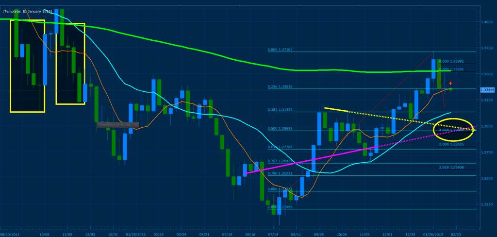
Yes and the continuation of a bearish daily pattern that was triggered; it’s a bit hard to see but I will illustrate the bearish pattern bellow:
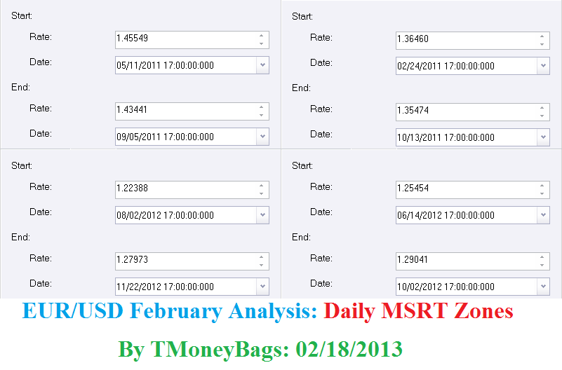
X = 1.41088 B = 1.25888 C = 1.24647
Here we have a Bearish gartley pattern that’s developed on the daily chart of the EUR/USD where the .786 and .707 of XA converge with 200% CD. Currently price has formed a shooting star confirming the pattern on the daily and a bearish flag as well (refer to my previous analysis of the pair titled “EUR/USD February Analysis 2013”).
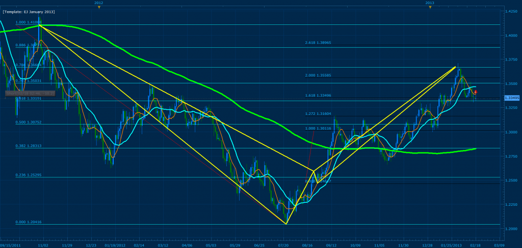
I know that the BC of the pattern above is unorthodox, but previous price history shows us that it has a good possibility of working. For example, the yellow circle illustrates the wick of price hitting 127% and stopping a major up trend; the red box illustrates a retest of that convergence where .500 of XA converged with 127% CD. The green rectangle illustrates the break of the convergence and the continuation of the trend. This in effects proves that price has respected both the XA and CD fib points. The yellow rectangle is the current convergence we have reached.
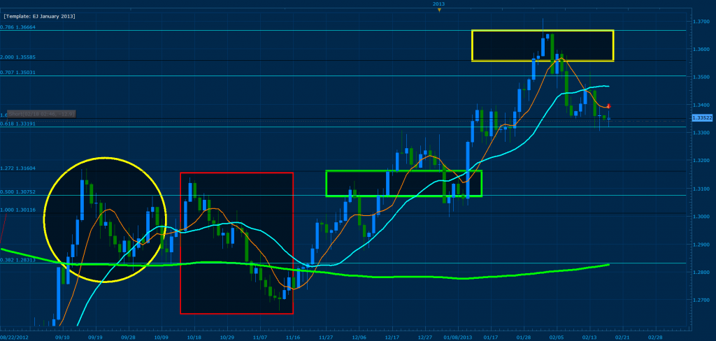
So, price is confirming the bearish movement… where will we go? Well, take a look at the targets bellow: each green horizontal line illustrates an upcoming convergence zone
I project the EUR/USD to reach 1.30-1.295 between February 23 - March 13. The yellow rectangles illustrate previous price movement off the 200 MVA (Green) after a bearish confirmation; to coincide with this, the weekly chart has created bearish railroad tracks off the 200 mva. Previously price has pushed an avg of 700 pips after respecting the zone within a 4 week time frame (yellow rectangles). The yellow trendline is a high to high that crosses with a pink MSRT where the .500 of XA converges perfectly with 261% CD of the first swing and 161% CD of the second swing.
Thanks for the analysis. I just want to add that there was a very strong support at 125 in the last few hours, and looking at the 4H chart, it seems like a flag in a bullish trend. Moreover, the key event of the week for the Yen will be the BOJ governor announcement which may be very bearish for the currency, while bad EUR news already happened last week.
Great analysis as always, thanks a lot! Haven’t had the time today to take a detailed look at it though. Hope to be able to do it before i go to bed.
Didn’t find anything good to trade today. Just scalped +10 pips of the EURUSD and am stuck in a -7pip trade on the USDCHF. Entered on a retest of a bearish gartley convergence and now price is just hovering.
I’m a technical trader Sam and from experience worrying about “spontaneous” news simply leads to a bias analysis. All I can do is prepare my self for what ever price is going to throw at me and go with the flow ;).
The long time frame of your recent analysis made me comment about fundamentals.
“Spontaneous news” as you say are not as temporary as you seem to think. For example, the rebound in EUR last year started when Draghi made strong supporting comments in late July. The sell-off in JPY started when the LDP gained momentum ahead of the election, coupled with hedge funds going in, while market dealers had to hedge their position.
In my opinion, technical trading can be really great in H8 and below, but for daily and weekly analysis, I think it has much more to do with central banks, politics, economic analysis, macro positioning…
I am still new, but my impression when I first started was that you would be right. But when there is news out that causes movement in one direction or another, how would the large players decide which levels to place their orders other than through technical supports and resistances?
Either way, TMB’s trade record should speak for itself. Then again, he was getting good results prior to all this long term analysis too, so I don’t know if it has added all that much.
@TMoneyBags, Thanks for starting and sticking with this thread. I’m very new to forex but have been doing some studying and am starting to get the hang of gartley and butterfly patterns, but I still lack confidence to trade them in a real account. I wanted to show a diagram from today’s 30-min AUDUSD chart that has already occcured, but I wanted to see if I’m drawing it correctly in your opinion or not… obviously it’s easy to look at what I’ve done and assume I did it right because the “trade” would have been successful. I just want to know if it is the same way you’d draw the chart.
The yellow line represents a near convergence between XA @ 38.2 and the CD leg between 88.6 and 100. So I chose the XA 38.6 as the D point and sell entry point. I then used the AD 38.2 and 61.8 as my first and second targets. I set my stop loss as 2 x ATR which is the pink line.
I would have hit both of my targets on a painless trade, but is this the correct analysis of the chart?
Why does my comment make you believe that my belief in news is temporary? LOL, I’m simply stating that from past experience worrying about what the true “movers” of price have to say does not lead towards any financial benefit. All it does is simply create a cloud of fear and doubt that leads towards bias analysis and/or the inability to execute properly as a technical trader. I am not God and do not know with 100% accuracy where price will go, but what I do know from experience in managing live accounts these past 5 years is that with a thorough technical analysis and discipline one can profit even from the factors that you mention. As for not being able to trade the daily and weekly charts technically… that’s absurd. You can not technically trade the 8 hour chart along with the lower timeframes and add consistant profit towards your account without a thorough technical analysis which includes that of the monthly, weekly and daily charts. In addition, there are plenty of traders out there including my self that have been able to successfuly analyze and trade the higher timeframes. By the way, my reference towards “spontaneous news” means that I’m aware that the BoJ and many other asian economic enteties tend to disburse major news in a “tentative” manner. In regards to YEN fundementals, please refer back to 2011 when Japan threatened to intervene against the yen if world economies continued to strengthen it (during that time, they clearly stated that they would be happy with the yen consolidating around the .80-.88 range which we have past). All in all,[B]if you want to argue fundamentals in this forum please create a new thread and leave the comments within this one solely based on technical harmonic analysis that go with or may improve the system.[/B]
Looks good, but I would like you to look for and consider other factors that add towards convergence besides the proximity of D and the X fib point. For example take a close look at the chart bellow:
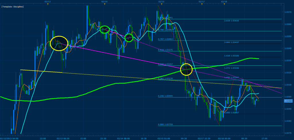
Using the same AUD/USD 30 min chart I’ve drawn support and resistance levels that add towards the convergence at the .382 of XA and 100% CD. This in effects tells me beforehand as price is flagging that it will push towards those trend lines and possibly reverse off the first convergence zone. In addition, the cross between the purple trendlines and 100 % CD would have signaled you around what time to expect D to form, in effect allowing you to be precise with execution and/or trade C to D. Use the color coded circles as reference on how to draw MSRT zones; as you will note here and in all my analysis, they are very helpful in predicting true convergence ;).
Samuelc stated clearly in his first post he made in the babypips forum, which was in here in this thread that he is not here to learn or contribute with anything then just negativity and criticism. I would not waste energy on him since what you do is exceptional and outstanding in my opinion…
Of course i think every one is allowed to question things done in here but it should be in a polite and adult way. Looking at his first post before i put him on my ignore list it lacked both politeness and maturity.
TMB, do you have a psychological or maybe even fundamental explanation of why these MSRTs work as a prediction tool? Like the Gartleys work because of buying and selling patterns reinforced by the implementation of Fibs in trading strategies. And earlier you mentioned you were trying to predict how bots would place orders based on an ABCD pattern.
Looking at this AU/USD graph, I can see that connecting the various crosses in different ways predict different peaks on the price chart, but it baffles me as to why that happens. A cross indicates fluctuations from a larger average movement. How does that result in prediction? Just curious to see if you had any theories.
From an earlier post, the green line is the 200 MVA. The yellow line appears to be connecting peaks of candlesticks, though I don’t actually seeing it being of much use at the convergence zone.