A P.A.T - Advance Price Action Trading

Hi all. As I’ve already introduced myself, I’ll be sharing more on price action trading under this thread.

A P.A.T
I understand that there’s a lot of price action traders over here so this isn’t a way I’m trying to make my approach seem superior than others’.

The title is abbreviated in such a way that as a trader…as you go through this journey, seeking success or a way that "works” for you, hopefully you can finally give yourself A PAT on the back for not giving up.

The rules are simple, you find a "significant level on the chart; supply or demand (support/resistance). Wait for price to interact with the area. Read price action from monthly until 1M in order to properly examine whether supply or demand is winning the battle - especially in areas of relative equilibrium. Let’s have fun and be civil towards each other while doing it.

4 Likes

Since I’ve been battling with time lately, I’ll start by sharing my currently running positions.

CADJPY, a weekly time period demand point of interest.

I unfortunately don’t have the privilege to post multiple images in one go so I’ll share reasons below.

GBPJPY Monthly demand point of interest

Reason for entry here was based on a springboard I found in the depth of the zone.

There was lateral price action I was observing within the zone from lower time periods but there wasn’t a clear signal to go in so I waited until the sideways price action showed a strong “sell off” to shake off weak hands out of any buy positions.

The chart below will show how I took the entry into the trade.

My entry was based on the M1 period. Once there was shortening of the selling thrust, I knew that it was the spring…that was when I bought with a protective stop right below the springboard.

My targets have been achieved but the maximum is basd on the price accumulation range on the monthly time period I shared above.

This method of entry is how I execute most if not all my trades.

3 Likes

I believe it’s time for me to share analysis. Current interesting pair is GBPNZD.

We have had a fake break above the daily highs as seen below.

That fake move was even covered by some of the authors in this very site, I saw it in my mailbox, thinking it was a breakout.

That was when my interest was picked. I noticed that the rally threw price right into daily supply point of interest (see your charts for reference)

1 Like

This is the supply area of interest on the weekly time period

1 Like

Talks about high time periods like these always need to be accompanied by the monthly chart.

We have had a bearish change in character. Breaking previous higher lows to form a new lower low - the eclipse in yellow. This means bear trend is forming

Entry is based on the distributing price action on lower time periods seen below.

The last areas of supply is where I have my sell orders placed.

Possible shakeouts happen in situations like this so I’m keeping a tight stop and a close eye.

With that being said, it feels like I’m just talking to a space… are any traders interested in discussion or commentary?

It would be great to get some sign of life in here.

Following, good stuff. I love reading up on how other traders use SD.

I will read it more carefully a bit later when I get more time.

Great to have you here.

1 Like

Thank you. I’ll keep sharing more, glad to see some life in here

1 Like

In my analysis I use lines more than anything to get some sort of “perspective” in a way.

I notice that over the past few posts, the time periods i posted aren’t practical for the daytrader while generally this system works for any trading personality.

Below I’ll show you how although this is a trade setup that is yet to unfold. We’ll take it as a case study

Case study 1 - EURJPY

Notice how in the image below all you see is just a boring price range that you typically can just take a hard pass on it when turning on your charts?

Now see this.

Now here we have a price accumulation range. Bulls have won the battle and we’re waiting on a test of the breakout.

Possible areas of demand are within the range, below or just above the resistance line price broke out of.

I can take questions, suggestions on how to get other traders interacting over here etc.

I use a similar approach except my range is from MN to H1 charts. I only go lower timeframes very rarely. I put down my thoughts on the EUR/JPY about 3 weeks back on a BP news thread as folls:

Close up of scr shot:

I haven’t read up on or apply any VSA/Wyckoff like methods yet to my analysis. So I’m not familiar with the concept of supply and demand in this context yet.

1 Like

I’ll share how you can apply Wyckoff, most importantly supply and demand analysis below.

Firstly, like your screenshot already shows us; The Daily Demand was marked as follows

2 Likes

Where does VSA/Wyckoff come in? was your question.

Firstly, I don’t use volume when analysing price action in forex compared to most Wyckoff analysts because aside from the fact that it’s virtually impossible to get accurate volume in forex, everything I need interpreted is in the candles, but that’s my opinion only.

When price comes into contact with the demand zone we had marked on the daily timeperiod above, we open our charts to lower time periods in order for us to observe if price is being absorbed or accumulated as it gets in the zone. This isn’t something we’d be able to tell from the daily chart perspective.

Here’s a lower time period I used;
H1 - EURJPY

We see here some stopping action as price comes in after strong bearish candles - this would be our preliminary support level, the first sign of demand coming in.

It is here, where sellers take profit or a good amount of demand absorbs any selling pressure.

The second sign is the shortening of the selling thrust. Notice how strong the bearish candles were before the preliminary support, now see how short the selling is from preliminary support to the new low - this is the seller’s climax. These two points (preliminary support and selling climax), form the borders - support & resistance levels of the potential trading range.

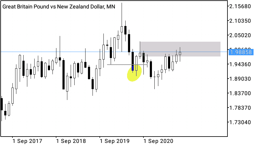
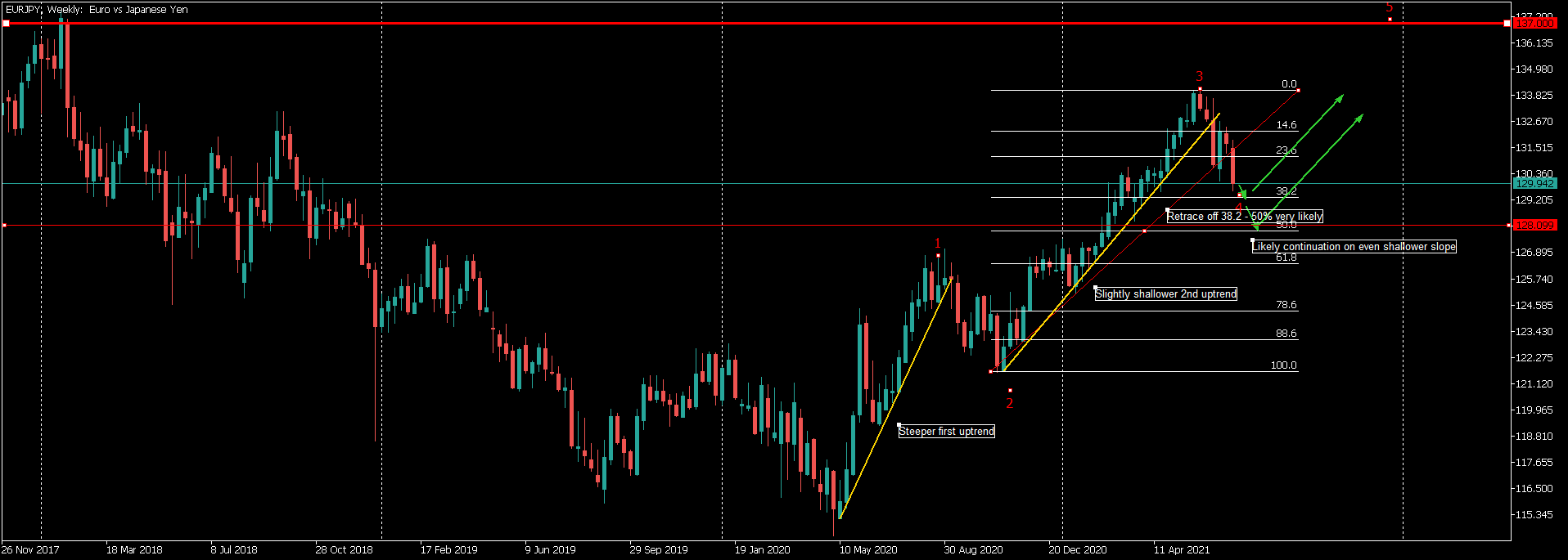
The accumulation schematic shown below tells us that, there’s some substantial demand coming into the market - let’s get ready for a potential change in the downtrend.

Accumulation Schematic diagram on EURJPY

This is how Wyckoff would label the supply and demand forces in the relatively equilibrium price range, our job is to find high quality entries in areas of such potential.

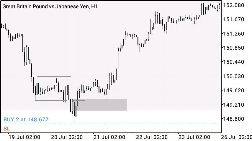
The important levels I would take note of in the labelled charts are; the springboard and sos (sign of strength). My entry was based on the spring.

A question would be, how do you know it’s a spring especially since the formation looks something close to a continued downtrend until the candle closes? Which would be an excellent question.

Lower time periods assist with understanding if in fact there is a shortening of the downward thrust. (1) Wicks coming from the bottom are a great sign selling is met with strong demand absorbing their every effort. (2) Failure for price to follow through after attempting a continued downtrend also means that a spring is forming. Typically, this looks like a “stop hunt” then contracts back into the range.

Entry is established when price expands to the springboard (stop hunting), once the candle closes - you place a protective stop below the candle.

As price contracts into the range, you’ll watch for demand control over price in order to be sure that this battle is close to being won by buyers. A good signal is price breaking the upper bound of the trading range as a sign of strength (sos).

We already know that when we have a breakout, there’s high chances of a retest of this break (resistance becoming support). This would be our lps - last point of support, where we can establish a second position long.

I am not sure if this covers your question, but I’m glad I was able to write it up for anyone who’s lurking and might find useful.

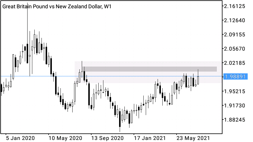
Basically, this is how I executed the above shared; GBPJPY, GBPUSD from the recent turning point (see the weekly/daily chart), CADJPY and EURJPY (this very trade)

3 Likes

Any recommended books to better understand the concepts?

Currently I’m going into EURCHF.

Monthly Chart; Demand area

Books on Wyckoff teach you to analyse both price action along with VSA. You then need to apply your own logic like I did with pairing it along with supply/dem but you can see Trades About To Happen by David Weis and his website. Henry O Pruden’s work and publications as well

1 Like

Yesterday I noticed price reached the bottom of the zone, so I started observing price action in lower time periods, here’s what I found.

EURCHF M30 accumulation;

I left an order, slightly above the resistance line break, my stop below the swing - given the bigger picture zone.